Colour has a big influence on us. Colour sets our mood and is a way to express ourselves. Colour has a symbolic value, which can be different per culture.
We are warned by colour. Red means beware of danger, while green stands for safety. Fire trucks are red. Sustainable companies often have green as their main colour.
Especially because of its recognizability and emotional value is colour important in graphic design and advertising. As a designer, you can deviate from generally accepted colours, just make sure you have a good reason for it.
Some of the links are affiliate links. As an affiliate associate, I earn a small commission when you purchase any of the products offered through the shared links at no extra cost to you. This helps me to maintain this website and I thank you for supporting me.
Table of Contents
Is colour important in graphic design?
By means of colour, a designer can give direction to the mood of the viewer. Fixed corporate colours ensure recognition and familiarity with a company.
The symbolic value of colour
Colours have always had a symbolic value. Sometimes this stemmed from an obvious phenomenon.
Like red, the colour of blood, which stands for passion and violence. The blood we feel running through our veins when we’re excited or the blood that is spilt in a war.
Sometimes colours are agreed upon. The colours that belong to a political party, for example.
Related: What Are the Symbolic Values of Red and Blue?
Keep the customs in mind
The following list is a summary of the symbolic value that we usually attach to colours in the Western world. Keep in mind that if you’re designing for an international company, the symbolic value can be completely different.
- Black: death, sadness, elegance, evil;
- Grey: moody, monotonous, conservative;
- White: purity, peace, virtue;
- Yellow: light, hope, deceit;
- Green: nature, abundance, calmness;
- Blue: cold, responsible, sad;
- Purple: creativity, royalty, mystery;
- Red: love, passion, anger;
- Orange: energy, happiness, vitality;
- Brown: earth, health, comfort.
How to use colour in designs

Limiting yourself to using a number of colours is a very nice way to add an extra dimension to your way of making designs. Here are some examples of how those limitations have been applied in my design practice.
By the way, I’ve always considered form more important than colour in my designs. So I always started designing in black and white and rarely protested when a colour I suggested was rejected by the customer.
Most of the designs also worked fine in black and white or black/grey/white.
Related: 7 Ways to Use Colour in Photography Creatively and Differently
Primary and secondary colours
Because of the old printing technique, I used to limit the colours in a corporate design to 1 or 2, but nowadays with the modern techniques, it is just as cheap or even cheaper to print – digitally – in full colour.
Until the last days of my graphic designing, I tended to use bright and even colours. That was to make sure that the logotype could still be applied in all kinds of techniques. After all, a corporate design will not just be printed in offset.
In the example of the logo of Exceed Expectations, I used the 3 primary colours plus green.

Complementary colours
The clearest examples of complementary colours are the pairs of red-green, yellow-violet and blue-orange. Red and green together can cause a problem for people that are colourblind (and 8% of the male population is!), so you’d better not use that combination in a corporate design.
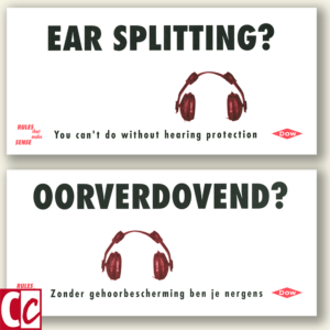
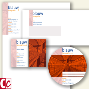
In the house style of Stadsherstel Breda, I have used the pair yellow-violet and for Blauw Photography (blauw is Dutch for blue) the colour pair is blue-orange.
Related: How Does a Colourblind Person See the World?
Monochrome
A colour can be mixed with white to make it lighter and with black to make it darker. The funny thing is that we call blue mixed with white light-blue and when mixed with black dark-blue, but we don’t call red with white light-red, neither do we call yellow with black dark-yellow.
Those colours completely change character when mixed. So we call red with white pink and red with black turns into brown. Yellow with black becomes olive green.
In my corporate designs, shades of a corporate colour were very common. For instance, my own stationery had shades of purple.
Colour splash
In the pre-computer period, I used a colour splash in Electron’s corporate style. Those shapes were cut out of a red film, which was used in the darkroom to make the offset printing plates, and combined with the images when lying on the press.
Electron’s corporate colours were black and warm yellow. They used yellow machines for constructing electrical grids, making the choice for one of their corporate colours easy.
Nowadays it’s easy peasy to make a colour splash with several apps that are available on smartphones.
Related: What are the Rules of Corporate Identity that Can Stand the Test of Time?

Warm and cold colours
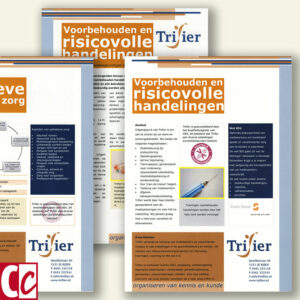
In the example of a brochure for Trifier, the warm brown and ochre colours are a counterbalance to the cold, businesslike colour blue.
Blue and red are the most used colours for corporate designs. Personally, I think blue is sometimes dull. But tastes differ.
Emotion in colour
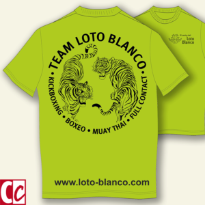
In some house styles, a pronounced colour can add much to the message. As in the example of Team Loto Blanco.
The most used colour in martial arts is black. Green, and particularly lime green does not occur a lot in the world of Muay Thai and is therefore very noticeable.
The symbolic value of colours
In a corporate style, it is important to realize that a symbolic value of a colour is not a global given. Yellow is a symbol of heroism in China, while in the West it is the colour of hate or cowardice. It’s something to consider when you have to design for an international company.
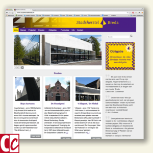
I had to design a security program for Dow Chemical. Most of it was for the Dutch factory, so I could safely use red as an indicative colour for danger.
What are your thoughts about colour in designs? Tell me in the comment box below.
This article is an update. Originally published on 19-03-2015.
Hi Hannie,
in the embroidery studio, we are always working with colours. The textiles we provide are always colourful, and we use more than 480 colours of threads to make the embroidery.
In many cases, we are tied to the house style of the customer, but they do not always know exactly what that house style looks like. In those cases, we advise based on the sector and image of a company.
In many cases, our advice is decisive for private individuals, because many customers themselves have no idea what they want exactly. We also take into account gender, age, skin complexion, psychological profile, etc.
Ultimately, the customer decides, but – as far as we know – the customer is always satisfied with the result.
Sounds great, Evert!!
Do you mean CDA, VVD and D66, the possible next Dutch government combination?
How do you mean, Eduard?
D66 members often opt for purple. Have a look at the ties of the gentlemen in the last days. VVD is often, apart from blue, also orange. CDA clearly has green as the club colour. I saw this map.
I wonder what colour the mapmaker of the FD would have given Utrecht if the colour of D66 had been assigned to it.
Hi Hannah, nice article.
Also for me as an interior architect, colour is very decisive in the design. Both as a corporate identity for companies and also for private individuals. People have an affinity with certain colours and feel comfortable with them. The psychological effect and spatial effect of colour also play a role in the overall picture. You can achieve special effects with this, especially in combination with good lighting.
After all, we all want a pleasant living and working environment.
Thank you, Percy. And you have a good addition to colour like this: colour in the environment makes a lot of difference! It’s also nice to have a look around your website. Nice work you have there.