
One of the best books in my private library is “The Art of Colour: The Subjective Experience and Objective Rationale of Colour” by Johannes Itten, a teacher at the Bauhaus who I admire so much.
Of course, Itten’s notions are only one way of looking at colours. Many researchers, artists and scientists have constructed a colour theory as well. But logically, as a designer and artist, I have a strong affinity with a fellow artist.
Itten explains the reality of colour and the way we as humans perceive colours. Colours affect each other. That influence is an action of our brain. “Eye and mind can only by comparison or contrast come to a clear perception.”
Some of the links are affiliate links. As an affiliate associate, I earn a small commission when you purchase any of the products offered through the shared links at no extra cost to you. This helps me to maintain this website and I thank you for supporting me.
Table of Contents
Colours affect each other
Colour is always surrounded by other colours that seem to change the appearance of that colour. Knowledge about this influence will help us with the choice of paint colour, but also with what we wear and how we decorate our house.
Colour reality and colour effect

On a black background yellow, red and blue will have more strength than on a white background. Both artists and designers take this aspect into account when creating their own work.
The color reality, which is physically definable, and the color effect that is the color as we see it under the influence of the ambient color(s) are not always the same. Sometimes that results in an unreal disharmony.
One of the causes is the simultaneous colour contrast.
Simultaneous contrast means that the human eye, when it sees a certain colour, needs the complementary colour and the eye or brain will generate this colour.
A test you can do yourself: Look at a brightly colored area for 30 seconds and then focus your eyes on white paper. Instead of white, you will see the complementary color of the viewed face.

At the end of the 18th century and the beginning of the 19th century, there was a great interest in physical phenomena. As a result, artists also became involved in the development of theories about this.
The German poet Goethe developed a general theory of colour. The French chemist Chevreul further focused the colour theory on simultaneous contrast. Both had an influence on 19th-century artists and on other colour theorists like Itten.
Related: A Helpful Colour Theory for Hobby Artists as a Thorough Foundation
Some examples
How pink was the dress?
The first time I consciously saw the effect of colours on each other was at a fashion academy presentation.
Every one had of course dressed in their best and hippest. Still, one woman stood out the most by wearing a pinker-than-pink dress.

Too bad for her, just before the start of the show, a woman walked in whose dress was neon-pink. Instantly, right before my eyes, the colour of the first dress changed as if it had been washed too warm.
An expensive mistake
The owner of a weaving mill had several hundred meters of expensive fabric woven with a black stripe pattern on a red background. However, the stripe did not appear black but green and gave the fabric such a restless effect that the fabric turned out to be unsaleable.
The simultaneous effect was so strong that the owner was really convinced that the weaver had used green yarn instead of black.
Red and green
Are you familiar with the expression “Red combined with green is a farmer’s decency”? It’s probably only a Dutch saying. Shutters and frames of the old farmhouses used to be painted in red and green. The expression is not meant positive though, because it means that something is of bad taste. 😉
A person that is colourblind can not distinguish green from red. The intensity of the colours red and green is the same. And if you’re not colourblind you can feel dizzy if you see the colours next to each other.
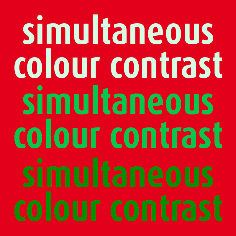
Sometimes I see books that have a red cover with green letters or vice versa. That is so hard to read, that my desire to pick up the book and buy it dies at the same instant.
Take the test: watch the red-green example with almost closed eyes -> the 3rd line is hardly readable.
Related: How Does a Colourblind Person See the World? Be Considerate of Others.

Dangerous colours
In the old days, the electricity cable used to have one green and one red wire. Thank goodness they were replaced by a brown and blue wire. Colour blind electricians made too many mistakes!
The funny thing is that one of my printers is colour-blind, but he has no problem with that whatsoever. He uses a densitometer to stay in control of the printed colours and therefore doesn’t have to rely on his own eyes!
Colour effect in favour of bakers and butchers
A pastry shop painted in light orange, pink, white and some black will whet the appetite for sweets.
A butcher’s shop is best painted in light green and blue-green colours so that the meat looks red and fresh. For the same reason, there are often green crepe paper rosettes between the bins.
The effect of colours on each other

Yellow, red, and blue are the three primary colours. Black and white, and the mix of them, grey, are not really colours, but they are important because of their effect on other colours.
The grey square in the middle of the orange and the blue frames is the exact same hue. It appears to be a cooler grey in the orange frame and a warmer grey in the blue one.
No matter how your monitor is calibrated – and this is something I have absolutely no influence on, each screen presents the colours differently – I expect that you can see the different appearance of the greys in the example?
Related: Why Is Colour Important in Graphic Design? What Are Practical Applications?

Amazing grey
Isn’t this amazing: when I was working on this article for the first time in 2012, I had been studying “The Art of Colour” for some days, when I went to a seminar in the Graphic Design Museum in my hometown.
The first speaker brought up Edward Adelson’s Checker shadow illusion. His question for the audience was, which square is the lightest grey, A or B?
I was amazed by the result. Aren’t you? (See video below the article)
To sum up how colours affect each other
- When we see a certain colour, the eye will evoke the complementary colour;
- A black background will make a colour seem more intense and lighter;
- When viewed against a white background, a colour will appear less intense and darker;
- Placing warm colours next to cool ones makes them appear warmer;
- Colours that are cool look even cooler next to those that are warm;
- When light is next to dark, the light colour appears lighter and the dark appears darker;
- When a bright colour is next to a desaturated one, the ‘dirty’ colour appears flatter;
- Putting a dark colour next to a light one makes them both appear brighter;
- The brightness of a bright colour is enhanced by the presence of a dark colour;
- Putting two similar-bright colours next to each other will make them both look less bright.
Do you have an example of the affect colours have on each other? Tell me in the comment box below.
This article is an update. Originally published on 7-11-2012.
For many years of his life, Goethe had doubts about whether to become a scientist or a writer. Fortunately, for him and us, he chose the latter.
In 1810, when Goethe’s color theory was published, the book was already ignored by most natural science experts. The professor of natural science Emil du Bois-Reymond called Goethe’s color theory: ‘stillborn fooling of a self-taught dilettante’.
At present nobody takes Goethe’s color theory seriously anymore. In contrast, and rightfully, his poetry, and novels are still read and his theater pieces are still performed.
He could’ve left it at that. But he was rather stubborn. He discarded Newton’s color theories and wrote to a friend that his color theory placed him in history in the same footage as Napoleon.
Your article explains how colors fool us. Or, to put it more in your line, how they challenge us. For Goethe, a challenge one step too far.
That is so cool, Angela, you know a lot more about Goethe than I do. That is obvious. 🙂
Didn’t Goethe mention anything about the influence of colours on each other? That would surprise me but is very well possible of course.
Anyway, thanks for a valuable addition. Take care.