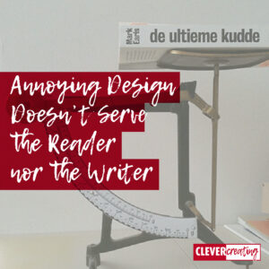
I’m reading a book with a really annoying design! The content isn’t bothering me; I can’t judge that yet, because I’m not beyond page 25 at the moment.
No, I find “De ultieme kudde“, which is a Dutch translation of the book “Herd” an annoying book because of the cover with a rear flap folded too tight, leaving part of the interior open and exposed.
This looks like the nowadays visible underpants of the youth because of their sagging jeans. (Ah, and this book is right about phenomenons like sagging pants!).
Some of the links are affiliate links. As an affiliate associate, I earn a small commission when you purchase any of the products offered through the shared links at no extra cost to you. This helps me to maintain this website and I thank you for supporting me.
Table of Contents
The chosen paper is an important part of the experience of a book

The second reason I think the book has an annoying design is because of the chosen paper. It’s too slick and too heavy. The kind of paper a designer would choose when there are a lot of pictures in the book. For the 2 or 3 pictures this book contains, it is hardly a justified choice.
I have another book on my bedside table that uses the same paper (“Winners! How today’s successful companies innovate by design”), but that has a hardcover and a lot of pictures. The first ensures that it folds open nicely and the second makes the choice of smooth, slick paper logical.
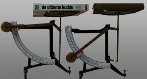
Measuring the weight

Comparing the 400 pages of “De ultieme kudde” with “Du Perron 1956, Collected Work, Part IV” (just a randomly chosen book), which nearly has 700 pages, the difference in weight is significant: 765 gr versus 410 gr! And that is the third reason I don’t like the book, it is way too heavy.
Design
The mentioned aspects are all about design and technique, not about writing skills. Too bad for writer Mark Earls, because I don’t expect he has had any say in the publication of translations. The fact that the publisher made wrong choices does not honour Earls’ work.
For the time being, I’m fascinated enough to keep up with the disadvantages. My story is merely a plea for good design.
(Thanks to one of my friends for the idea of weighing the book and thanks to one of my clients who mentioned the title, which led me to buy it).
Edit to this article 2017
Nowadays I don’t even want paper books anymore. I prefer ebooks. My Kobo is small and light. I can read the text in the font size I want. Bliss!


Geestig – ik las “De ultieme knudde”. Betekent dat mijn onbewuste geest alvast voorsorteert op wat mijn tragere brein pas bedenkt na lezing van de blog.
🙂