
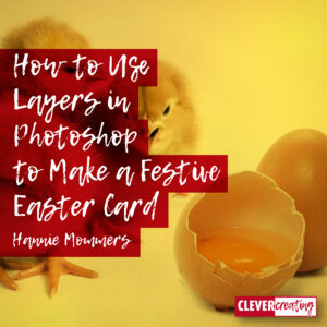
Using layers in any creative computer program is a marvellous way to enhance our creativity. In this article, I will explain how to use layers in Photoshop, applied to an Easter card.
Once you know how to benefit from working with layers, you can use them for any kind of creative expression.
Besides using them for masking, I often toggle between layers to turn them ‘on’ and ‘off’ so I can judge differences. Making variations and looking at which one pleases me most, is easy that way.
Some of the links are affiliate links. As an affiliate associate, I earn a small commission when you purchase any of the products offered through the shared links at no extra cost to you. This helps me to maintain this website and I thank you for supporting me.
Table of Contents
How to use layers in Photoshop
Use layers to toggle between variations of your design and to mask parts of the image for special effects you want to achieve.
Memories of Easter when I was young
When I was a kid my mother used to paint eggs together with me. I have to admit, she wasn’t very creative. So the painting meant putting dye in a saucepan with boiling water and cooking the eggs in it for 7 to 10 minutes.
Noticing my mother was not very creative is a conclusion I made in retrospect and doesn’t have any influence on the warm, cosy feelings I still have for the activity. It is a cherished memory!
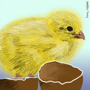
I hope to make such memories with my grandchildren so I decorate real eggs with them as well. And I make Easter cards on paper or on my computer.
Related: 8 Fun Ways to Decorate Easter Eggs for Ornaments or Egg Hunts
Layers in Photoshop

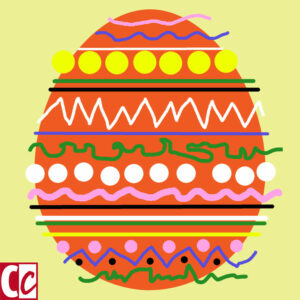
I make my drawings either in Adobe Illustrator or in Adobe Photoshop, but any program with the possibility to work in layers will do. In this example, I drew the egg in Illustrator, pasted it in Photoshop, and added the other layers.
You can draw an egg in an illustrator program too or draw it on a piece of paper and scan it. You’re also welcome to download an SVG file of my egg (no login required). This document can be opened in several programs.
Open a new document in Photoshop
Fill the first layer with a light colour you like as a background for your card.
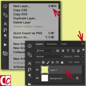
Make a new layer
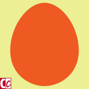
Draw an egg on the second layer in a colour that is a different and darker colour than the background in a new layer. There are 3 ways to make a new layer.
- Open the hamburger menu in the top-right corner and click New layer;
- Use the key combination shift-command-N on a Mac or shift-control-N on Windows;
- Paste a shape into the document.
Decorate
In the next layer draw as if you are decorating an Easter egg. Don’t mind going over the edges, we’ll fix that later. That’s the reason we work in layers.
I love decorations that are not very precise and geometrically, but if you do want it precise or even symmetrically, then Illustrator would be a better place to draw. (You can copy and paste it later in Photoshop).
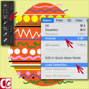
Get rid of the overspill
Select the egg in layer 2 with the Magic Wand in the menu at the right and invert the selection in the menu at the top or by using a key combination.
Menu Select > Load selection > Channel transparancy.
Menu Select > Inverse.
With the selection still active go to layer 3 and hit the backspace button on your keyboard. Now you have thrown away all the extra frills and created a flawless egg.
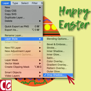
Add some text
Add a text as a wish or a greeting. Choose a font, a colour, and a composition on the card. You can leave it like it is or add a drop shadow in the Layer menu on the top.
Let the egg stand out from the background
The former step could be the final one, but if you’d rather have a 3D egg, you can continue your design.
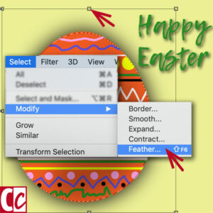
Select the egg, add a layer below it, and use Feather to make the border soft. The number of pixels you have to use depends on the size of your image. You will have to try something and if necessary modify it.
Menu Select > Modify > Feather.
Fill the selected shape with black or grey. Leaving it at that, it would look like a shadow on the wall. A shadow on the ground has the shape of an oval. Select the shadow and distort it by using the top-middle handle.

Do you want a 3D egg?
The shadow must not be too dark, so you either change the opacity of the layer, or you use grey to begin with. Move the layer horizontally a bit, suggesting the light falls on the egg from the side.
To make the illusion complete there has to be a darker part on one side of the egg and a lighter part on the opposite side.
Make a new layer above the egg layer. Draw a comma-shaped form with the lasso tool, feather and fill it the same way you did in the former step.

Make variations in colour
Make one layer of all the layers that form the egg, duplicate it, and change the hue. For this go to menu Image > Adjustments > Adjust Hue/Saturation and play with the levels as much as you want.
I am a fan of Adobe Photoshop

As a former graphic designer and fanatic photographer for my hobby in the present, I am an intensive user of Adobe Photoshop. I started working with it in 1991 (version 2!) on a computer that had a 4Mb working memory. 🙂
If you only occasionally crop a picture or change the colours a little bit, Adobe Elements will be sufficient. Or an app on your phone, such as Snapseed.
But if you want to work in layers, have absolute control over the effects that you add and want to use channels and masks, then Adobe Photoshop is a good choice.
Don’t let all the possibilities overwhelm you, but start with step-by-step tutorials for a specific product, like this one about a card.
This article is an update. Originally published on 1-03-2013.
Thanks for another great tutorial for a DIY card, dear Hannie!
I like playing with layers – I am a beginner in Canva and practice layering there. But I didn’t think of designing my own easter card with the program, so thank you for the inspiration.
Since I am already learning on so many different levels (or should I say layers, lol) I do not start with Photoshop yet, Canva is my focus for now. But as you already told us, the same design principle can be practiced there, so I will give my easter card a try!
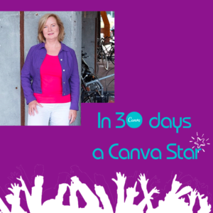
Marvellous, Kadanza. Yes, Canva is a great program. Did you see my video of a chick coming out of the egg? That was made in Canva as well. I did the course “In 30 days a Canva star” and it really speeded up the learning curve of Canva for me. 🙂
Happy Easter!
Tried learning Photoshop two or three times already, but the learning curve is so steep I gave up. Can you recommend a Photoshop course that is failproof? I want to learn but the pace at which some of these courses are taught makes it impossible for me to follow along.
Hi Caroline, if I want to learn something new I start looking at Udemy. They often have an offer for cheap courses that are really good. I learned all the ins and outs of Pinterest this way. I bought 2 courses for $10 each. One wasn’t that good, but the other one made up for that on a huge scale. That way you can see which pleases you and still don’t spill a lot of money.
I hope that works for you as well. Thanks for your comment and good luck.
I need to upgrade to Photoshop to up my game, my blog and social media channels could do with a refresh. I’ve used Canva for a while but lately it seems everyone is using it and some elements tend to repeat way too much for my liking.
Oh, yes, Alexandra, if you have a professional blog, Photoshop is a marvellous investment. Or if it’s too expensive at the moment, try Lightroom as a very good alternative.
What I usually do, is look at Canva to get ideas and then develop those ideas with additions of my own in Photoshop. Because you are right, some elements can be seen all over the internet. 🙂
Good luck with expanding your options.
You have explained the concept of “layers” so beautifully, thanks so much for taking neat screenshots of every step, that truly helps. As I read your post ideas are brimming in my mind, I mean there is so much one can do with the “layers” feature – I mean you can stack multiple images, add text, even add vector graphics – Thanks for sharing this informative post, loved reading through this!
I am really pleased with your remark about the screenshots, Satz. Because it’s such common stuff to me, it is always hard to figure out the number of steps I should make. Too many are boring, not enough makes the explanation bad.
Yes, you are right, you can add anything to the layers. The best tool in my eyes is the possibility to make the layer invisible. That way it is so easy to compare several designs without having to make all of them separately.
Thank you for your comment and have fun designing.