In How to Make Money from your Hobby or Passion? one of the mentioned possibilities is having your own website.
Most hosting providers offer a one-click process to install a WordPress blog, which makes starting really easy.
So this article WordPress Tips for Beginners is not about installing, but about aspects to make visiting your website a great experience.
I will explain 12 aspects that – once implemented – will give your visitors a great user experience. Making sure they want to come back.
Some of the links are affiliate links. As an affiliate associate, I earn a small commission when you purchase any of the products offered through the shared links at no extra cost to you. This helps me to maintain this website and I thank you for supporting me.
Table of Contents
WordPress tips for beginners
The biggest mistake most beginners make is that they complicate the whole process. WordPress has infinite choices. However, this doesn’t mean that you should choose all of them from the start.
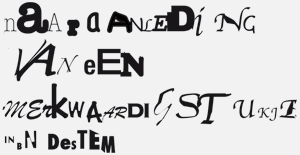
Even if there are hundreds of plugins… Even if you can choose all the colours you want… Or every font that is available… Restrain yourself.
The visitors to your website will appreciate it.
Related: 11 Steps to Start a Website for Personal or Business Use
Readability is partly about language and partly about design
Do you consider yourself a great writer? Most people will probably say “No”. I know I will say that as well. I am not Hemingway or Shakespeare. The point is, it doesn’t bother me, not anymore.
When I started blogging over 20 years ago (oops, that sounds like ages ago, doesn’t it!) I thought written text should be pompous and formal. I had a website for my graphic design studio and every text was marketing talk.
Whenever I bump into websites like that nowadays I click away in a heartbeat. I can’t believe I used that same babble.

1. Make a normal conversation from your text
A normal conversation doesn’t mean you have to say “Yo” or “Bro”, unless your target audience is using that kind of words all the time. It just means talking in a relaxed and sensible way.
2. Avoid long sentences
When a sentence exceeds 20 words, it’s better to split it up. Most of the time this is doable. Even when you think it is not.
3. Divide your text into small paragraphs

Imagine what kind of texts you like to read yourself on the internet: Endless, book-like sentences that go on and on? Or small, bite-like texts that make it easy to grasp what it’s about?
Paragraphs of 2 or 3 sentences work best. After that put either a blank line (a return on your keyboard) or a subheading.
4. Add breathing space to your blog
These blank lines let your page ‘breathe’. Compare it to talking. After a couple of sentences, you will take a breath. This is a natural pause, that gives both you and your listener/reader a bit of rest.
Images with enough white space around them have that same effect.
Design, the look and feel of your website

Even as a graphic designer I never assumed design was more important than readability or user experience. Design is accommodating. ‘Beautiful’ is never an important issue.
It doesn’t take much effort to take a look at a website and acknowledge the beauty of it. You usually can see and conclude that in the blink of an eye.
However, determining the usability requires more effort. This tension between the beauty and usability of a website often allures us to pay more attention to a website’s attractiveness.
Beautiful is not equivalent to effective, although a website can be both at the same time! ~Hannie Mommers
Mind you, I am not saying you shouldn’t have a beautiful website. I just mean it comes in third place. Another aspect of beauty is, that it’s about taste. And we all have different tastes.
5. Choose a font that doesn’t confuse the reader
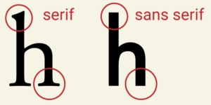
A very crude classification of fonts (letters) is Serif and Sans Serif. Serifs are small strokes at the end of a larger stroke. The most frequently used fonts are sans serifs like Verdana, Trebuchet and Arial. A well-used serif font on the internet is Georgia.
Any (big enough) font that resembles one of these 4 mentioned is a good readable font and very useful for the text of your blog. For headings or quotes, you could use a font with more fantasy, as long as your visitor doesn’t have to guess what it says.
Related: How to Use Typography in Web Design? 7 Proven Do’s and Don’ts
6. Left alignment guides the reader
English is read from left to right, so use the left alignment. With a centred or right alignment, your visitor’s eyes need to readjust at every start of the next line.
Justified text (aligned at both sides) was necessary for the technique of book printing and is truly old-fashioned.
7. Have enough contrast in the colours you choose
Restrict yourself also in the number of colours you use. One or two (consistent) colours to go along with the black or dark grey you use for the text and the white of the background. As you can see, for me it goes without saying to use black or dark grey on white for a good reader experience.
Sometimes you need an accent colour for a button or text that really has to stand out. Make it harmonious with the other colours (this is a great tool to help you choose) and again: be consistent once you have chosen.
Related: Why Is Colour Important in Graphic Design? What Are Practical Applications?
8. Nice to have: your own favicon

A favicon is a little icon in the address at the top of the browser. A WordPress website has a white-on-blue W as a standard favicon. It’s very small (16×16 pixels) and can’t have too many details. And it’s not an absolute necessity, but nice to have.
Years ago I made 36 favicons to choose from as a give-away. If you want one or just want some inspiration, then go to Do you want your own favicon on your website?
Put your visitor at ease with a good user experience
9. Reading shouldn’t be a tennis game
I bet you know those images of an audience at a tennis game. It’s hilarious to see their heads go from left to right and back in unison, following the ball with their eyes.
It shouldn’t be necessary to make the same movements when reading a text. And at some websites, you are forced to do that because the width of the site is huge. Choose a WordPress theme that is not wider than 1000 pixels, or a theme that is adjustable to 1000 pixels.
This is irrelevant for mobile viewers, but there are still a lot of people who browse the internet on a desktop computer.
10. Be careful with repetition
In any manual about blogging, the general guideline is to divide your text into 3 parts. The first part is the intro in which you tell what your topic is about. In the second part, you explain everything about your topic. The third part is the conclusion summarising what you have just said.
It’s a good rule of thumb, although I must admit I am not always abiding by this rule. And if you counted with me that is a maximum of 3 times mentioning the same topic. More is overdoing it. Really.

Always try to put yourself in the shoes of your visitor. What does he or she see and read if they visit your website for the first time, the second time, or the tenth time? Is the experience still fresh for the tenth time? Or is the visitor getting bored because of extensive re-use of the same images and the same texts?
Sometimes you reread your text and you notice the repetition of a certain keyword. A great website to look for synonyms is Thesaurus. And Google Translate will give you synonyms for English words as well. It doesn’t matter what language you supposedly want to translate it to.

Read your text out loud. You will quickly notice whether the cadence is smooth enough. Stumbling means that you have to look critically at the text again.
11. Some WordPress standards should be changed immediately
WordPress adds a couple of standard phrases that are not meant to be left as they are. “Just another WordPress site” is one of them. It’s the subtitle of your website and if you have no idea what to change it in, then remove it. No problem.
Another standard is “Uncategorized”. Make a couple of categories that will be logical groups for your website and choose one that you will probably use the most. Make that your standard, what you can change in the first line of > Settings > Writing.
Once you have done that, you can delete Uncategorized altogether.
Don’t get overwhelmed
When you are a beginner in WordPress I can imagine that 12 aspects can seem like an awful lot. If that is the case, don’t let yourself be overwhelmed. It’s more important to start writing and working on your content than to get everything right from the start.
That is the biggest advantage of WordPress. Content and design are two different elements and you can change either one of them without messing the other.
Do you have questions?
Don’t hesitate to put your questions about design or technique in the comment box below. I’ll be happy to help you. 🙂
P.S. If you want more basic information about starting a website, I would suggest Wealthy Affiliate. Maybe you don’t want to be an affiliate right now, but eventually, chances are high that you want to have a way to monetize your website.
The free version of Wealthy Affiliate has 10 lessons. Parts of what I have described here are discussed in more detail in those 10 lessons.


Very useful and practical tips on wordpress for beginners. Even I learned few things from your lovely post. It’s visual and easy to follow.
Thank you for putting this together and sharing it with us all. It’s highly appreciated.
Best wishes
Thank you so much, Habib 🙂
An informative and well laid out website full of useful tips and ideas.
Thanks for the compliment, Simon 🙂
A well thought out and constructed post full of good ideas and tips. Really enjoyed reading this and keep up the good work.
Hi there,
What an insightful post, I never knew about the Serif and Sans Serif before. I was interested particularly in your section about justifying text. I was taught to use it as it makes the text look neater and easier on the eyes. What’s your opinion on this?
Hi Sharon, thanks for your question. All the more because it truly amazes me you got advice like that. It is the opposite. And that’s not an opinion, but based on several reading tests.
Justified text was a technical necessity in the early days of book printing. I won’t elaborate on that, because that would be a blogpost on itself. With nowadays technique it is redundant. The main disadvantage of justified text is the appearance of “ditches”, a kind of holes, which make reading very tiring for your eyes. Text should be an evenly ‘gray’. If that makes sense?
If you are interested: I made a blogpost about text years ago. You can read it here: https://clevercreating.com/text-in-a-blog-or-website/
That makes sense, I think it’s just as well I can’t justify on WordPress so. Thanks for the link, I’ll have a read of that.
Sharon
Great 🙂
Hi Hannie,
You rightly identified my initail mistake when I started blogging – I wanted it all.
I wanted my website to appear powerful, so i took all that I was advised. With time the whole process became over whelming and I felt it was difficult and it would not work. Later, i knew i needed to learn and take it one after the other like you adviced.
I then focused on creating quality content for my audience to read and not a magnificent website.
Exactly, Ayodeji, that last approach was the best! 🙂
I love these tips for WordPress beginners. My Theme automatically chooses my font. Do you know how I can find or change this?
I’ll make some screen shots and put them in a separate post, Catherine. And DM you when it’s ready, OK?
I read this post with great interest. I must confess, you helped me with some good Tips. I will correct some mistakes I was doing. Thank you for sharing. I wish more and more people could read this.
Thanks so much, M. Glad I could help!
Hey Hannie. Brilliant article! I am quite new to WordPress, so all the tips you have provided, will definitely be useful for my development as a writer. I am quite proud of my self, as I have done most of what you mentioned, so least I am on the right track. Thank you.
Very good, Puneet 🙂 Most of the time it’s a matter of using common sense. 🙂
Hi
Thanks for putting together this very informative article.
I made many of the mistakes you mention when I built my first website. I certainly used so many plugins that my site speed suffered.
I love the fact that you mention the need to stay simple. I’ve found this to be the best way too.
I see you’ve used just a few images in your text, and they are all to the right. Would you say this is best? I’ve always placed my images in the centre, and used them as a break between paragraphs.
Do you think images are very important? I ask, because I think they may be slowing my site too.
Thanks again.
Hi Judy, thanks for your comment! My images are put to the right, because I want the reading process to be as smooth as possible. This way – at least on a desktop that is – the starting point of the text is always on the same left. As is with your centered placement – so that’s fine. That I do not like the empty spaces left and right of a centered image is a matter of personal taste. And personal taste says nothing about usability 🙂
Whether images are important depends on the subject. If the subject is very visual you’ll need more images that when it’s not. If the subject is about information then text is important and the way you write.
You can influence the site speed by using plugins like Kraken or Smush. And by uploading an image that is not too big in the first place. I use Photoshop for that. But most photo programs have edit options. And another way is to email pictures to yourself – some email programs reduce the image sizes.
I hope this helps. Feel free to ask more questions. 🙂