Often people assume that the meaning of symbols is easier to comprehend than written text. Most of the time, this assumption is wrong.
In the same way that any foreign language must be learned, the idiom of symbols must also be learned. Some symbols or characters are immediately obvious, others require a table with an explanation.
However, we pick up a lot of knowledge about symbols just by looking around in the town where we walk or using public transport. And when everybody knows the meaning of a certain symbol, it communicates a lot quicker than written language. Especially when many languages are used in one place, for example at an airport.
Some of the links are affiliate links. As an affiliate associate, I earn a small commission when you purchase any of the products offered through the shared links at no extra cost to you. This helps me to maintain this website and I thank you for supporting me.
Table of Contents
The meaning of symbols
A symbol is a carrier of meaning. This meaning is usually based on conventions. However, the form of the symbol and its meaning don’t always match.
The use of symbols and icons

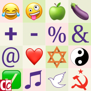
Nowadays we use symbols and icons all the time. Who doesn’t use emoticons on the mobile phone?
What is the difference between symbols and icons?
Roughly speaking an icon is an illustration which resembles what it means. For example, the icon of a shopping cart of a webshop or the 3 circular arrows of the recycle icon.
A symbol has a meaning that is not necessarily the exact illustration. An image of a heart means love. A 6-pointed star represents Judaism. And the meaning of the eggplant emoji has also changed over time.
A symbol does not have to be an illustration. It can also be an idea or an object. The Holy Mass is a symbol of Christianity. The Berlin Wall was the symbol of the Cold War.
Related: What are the Qualities of Good Signs that are Eye-catching and Valuable?
Well-known symbols

Almost everyone also knows symbols that are older than the emoji. You might not think of them as symbols, yet we all use mathematical symbols such as the plus + and minus sign -, per cent %, and et-sign &. And more recently, the at-sign @ was added to our general knowledge.
Related: What is the Purpose of a Ligature in Typography?
Other well-known symbols are the signs of all the different religions. The 2 different crosses of the Roman Catholics and the Orthodox Catholics. The Yin Yang sign of Taoism.
The symbolism can also be expressed in the clothing. The hijab and burqa of Islam, the kippah of the Jews.
We only know the definition and meaning of symbols from the way they have been used over and over. Like we recognize Nike’s swoosh because it has been used countless times in advertising campaigns and clothing.
Don’t assume

I never knew that the emoticon with the crossed eyes was the symbol to indicate ‘blind’. Do you ever come across examples of icons or symbols that you think are confusing?
The general assumption is that people understand icons without explanation. An icon or symbol would promote communication between people who speak different languages. An icon would be borderless.
Unfortunately, symbols and icons are not borderless.
When we have been driving a car for years and have seen the same traffic signs abroad, we might conclude that the meaning of traffic signs is universal. In the meantime forgetting that we had to learn them when we took driving lessons.
A corridor full of coal
The picture below is a good example of an assumption. It was an instruction hanging in an African mine. The intention was that illiterate African miners would pick up the lumps that they found lying in the corridors and take them to their final destination.
However, the picture is based on the Western convention that everybody reads from left to right. An illiterate does not know this convention, which explains why the corridors were filled up with more lumps because the miners thought that the picture asked them to do so.

Symbol and icon language is like a foreign language
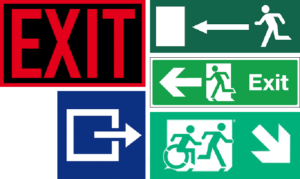
You must learn to speak a foreign language. Once you know that language, it is easy to communicate. Most people find the exit when it is urgent IF they know and understand the EXIT signs as shown below.
America thinks the red EXIT board is very clear, “because everyone speaks English over here”.
Yeah right. Forgetting about the huge Hispanic community in several parts of the country.
In Europe, we have always been aware that there are many languages. The sign on the top right has been used for a long time. Later a variant was added where the word Exit is put next to the image.
I will spare you the discussion about the lack of doors on these signs. Anyone who knows the sign will remark: Oh, but those white parts are doors! In fact, they are just squares and if you don’t recognize them as doors the sign fails its intention.
If you want to know more about this, you can read it here: The Big Red Word vs. the Little Green Man.
The icon on the blue board has been developed for the Dutch railways (NS). Research from several years ago showed that an astounding 48% of travellers did not know what it meant. Also that sign now has a variant with text.
Do you also think that sign on the bottom is funny? I hope it means that there is a lift or a slope for the disabled in the direction indicated and that it doesn’t lead to the stairs!
Related: Symbols and Trends
Designing icons is fun
After this explanation, you understand that I do not have the illusion that icons are easy to read. However, it is a pleasure to design them. If your company consists of different departments, then it is a challenge to come up with icons to symbolize these.
For my crowdfund campaign years ago, I designed six icons that represented the most important elements of my profession. The pictures were also suitable for a ScribeVideo as you can see below.

What is the essence of a concept such as typography or colour? Which symbols can people understand without a lot of explanation?
They serve as decoration and if I repeat them often enough, they will eventually be recognized.
Still, I am aware that people can just as easily assume that the third icon is meant as a symbol of ‘rest’ or ‘sleep’. 😉
How do you feel about symbols? Tell me in the comment box below.


-Mooi, die handjes die het beeld maken. Populair in Belgie voor de Grote Parade in Brussel op zo-midd 29 maart zijn dito filmpjes gemaakt met 10 Hartenwensen. https://www.youtube.com/watch?v=7lfDacOJSjk&feature=youtu.be.
-Je anekdote over leesrichting en cultuur geldt ook voor de legende over de Nutricia-afbeelding op een etiket: 3. een huilende baby, 2. een flesje melk en 1. een blije baby. In oosterse culturen is de leesrichting wéér anders.
-Ben ook erg benieuwd naar de vraag of mensen het icoon op wijn snappen: een gestyleerde buik met een diagonale streep erdoor.
-Ook het icoontje voor de financiele bijsluiter is OP TV erg onduidelijk (en valt alleen te begrijpen als je ziet dat er ook andere varianten bestaan waar het glas halfleeg is)
Leuk, hè Rein, als je eenmaal erover begint, komen er steeds meer voorbeelden. Dank je wel voor de jouwe.