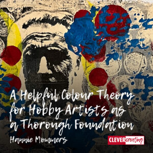
Why Do Typeface Designers Use Optical Illusions?

Why Do Typeface Designers Use Optical Illusions?

Typeface designers and graphic designers know that if they work mathematically and exact, everybody will think they are bad designers. They have to use tricks to make sure that designs are well-balanced.

In What are the Benefits of Negative Space for Designers and Artists? I explained the trick of negative space. In this article, I will explain how designers use optical illusions.

Some techniques require adjustments that might not be optical illusions in the usual sense but are nonetheless necessary. I will give an example of that as well.

Read more

What is the Purpose of a Ligature in Typography?

What is the Purpose of a Ligature in Typography?

Ligature has a lot of meanings. The word is used in music, medicine, and language. This article is about the meaning of ligature in typography.

If computers had been invented before the printing technique, I wonder if there would have existed ligatures the way they do now. I am so glad that my education in my youth included hand-setting loose lead letters.

This literally gave me a feeling of the typographic origin of corpses, leading and kerning, as well as ligatures.

Read more

Is the Meaning of Symbols Easily Recognizable to Everyone?

Is the Meaning of Symbols Easily Recognizable to Everyone?

Often people assume that the meaning of symbols is easier to comprehend than written text. Most of the time, this assumption is wrong.

In the same way that any foreign language must be learned, the idiom of symbols must also be learned. Some symbols or characters are immediately obvious, others require a table with an explanation.

However, we pick up a lot of knowledge about symbols just by looking around in the town where we walk or using public transport. And when everybody knows the meaning of a certain symbol, it communicates a lot quicker than written language. Especially when many languages are used in one place, for example at an airport.

Read more

What are the Qualities of Good Signs that are Eye-catching and Valuable?

What are the Qualities of Good Signs that are Eye-catching and Valuable?

There are good signs and there are bad signs. To know the qualities of good signs we just have to look around and experience the signage that surrounds us.

Don’t you agree that a lot of signs are confusing? Our environment is so full of messages, promotions, and both visual and auditory noise, that it’s hard to focus on the signs that we need at a specific moment.

Still, some signs are marvellous. In a way, it’s a pity that the better the design is, the less we notice the signs because they do their job instantly and without complicating things.

Read more

How to Use Typography in Web Design? 7 Proven Do’s and Don’ts

How to Use Typography in Web Design? 7 Proven Do’s and Don’ts

The guidelines for typography in web design are not that different from the guidelines for text in any use. Whether on a screen or on paper, on a truck or on the facade of an office, always ask yourself: “Can people read this in an easy and clear way?”

Almost half of all websites worldwide are made with WordPress, including this website. While WordPress simplifies a lot of typographic decisions, it is still important to have a basic understanding of how typography works.

The following tips apply to both using HTML and CSS, as well as WordPress or any other CMS (Content Management System) website.

Read more

How to Improve the Colour Quality of your Printed Pictures

How to Improve the Colour Quality of your Printed Pictures

The quality of the printers is improving fast. Nowadays a lot of colour printers have more than four cartridges, making sure all the tones are printed. 

Yet, the extra cartridges are grey or black, never a colour, which means there are still colours you see on the screen that can’t be printed on paper.

Taking pictures and printing them on your colour printer can be disappointing. Sometimes the result is NOT what you expected. I’ll give you the reasons for that disappointing result and whether you can improve the colour quality of your precious photographs.

Read more

How Do Colours Affect Each Other and What Can We Do with this Information?

How Do Colours Affect Each Other and What Can We Do with this Information?

One of the best books in my private library is “The Art of Colour: The Subjective Experience and Objective Rationale of Colour” by Johannes Itten, a teacher at the Bauhaus who I admire so much. 

Of course, Itten’s notions are only one way of looking at colours. Many researchers, artists and scientists have constructed a colour theory as well. But logically, as a designer and artist, I have a strong affinity with a fellow artist.

Itten explains the reality of colour and the way we as humans perceive colours. Colours affect each other. That influence is an action of our brain. “Eye and mind can only by comparison or contrast come to a clear perception.” 

Read more

How to Use Layers in Photoshop to Make a Festive Easter Card

How to Use Layers in Photoshop to Make a Festive Easter Card

Using layers in any creative computer program is a marvellous way to enhance our creativity. In this article, I will explain how to use layers in Photoshop, applied to an Easter card.

Once you know how to benefit from working with layers, you can use them for any kind of creative expression. 

Besides using them for masking, I often toggle between layers to turn them ‘on’ and ‘off’ so I can judge differences. Making variations and looking at which one pleases me most, is easy that way.

Read more