How to Improve the Colour Quality of your Printed Pictures

How to Improve the Colour Quality of your Printed Pictures

The quality of the printers is improving fast. Nowadays a lot of colour printers have more than four cartridges, making sure all the tones are printed. 

Yet, the extra cartridges are grey or black, never a colour, which means there are still colours you see on the screen that can’t be printed on paper.

Taking pictures and printing them on your colour printer can be disappointing. Sometimes the result is NOT what you expected. I’ll give you the reasons for that disappointing result and whether you can improve the colour quality of your precious photographs.

Read more

How Do Colours Affect Each Other and What Can We Do with this Information?

How Do Colours Affect Each Other and What Can We Do with this Information?

One of the best books in my private library is “The Art of Colour: The Subjective Experience and Objective Rationale of Colour” by Johannes Itten, a teacher at the Bauhaus who I admire so much. 

Of course, Itten’s notions are only one way of looking at colours. Many researchers, artists and scientists have constructed a colour theory as well. But logically, as a designer and artist, I have a strong affinity with a fellow artist.

Itten explains the reality of colour and the way we as humans perceive colours. Colours affect each other. That influence is an action of our brain. “Eye and mind can only by comparison or contrast come to a clear perception.” 

Read more

Why Is Colour Important in Graphic Design? What Are Practical Applications?

Why Is Colour Important in Graphic Design? What Are Practical Applications?

Colour has a big influence on us. Colour sets our mood and is a way to express ourselves. Colour has a symbolic value, which can be different per culture.

We are warned by colour. Red means beware of danger, while green stands for safety. Fire trucks are red. Sustainable companies often have green as their main colour.

Especially because of its recognizability and emotional value is colour important in graphic design and advertising. As a designer, you can deviate from generally accepted colours, just make sure you have a good reason for it.

Read more

An Optical Illusion Plays Tricks with our Eyes

An Optical Illusion Plays Tricks with our Eyes

In 32 tips to get ideas to spend your free time is a pencil drawing of a shape, giving the optical illusion that the inner circle is much whiter than the surrounding white outside the circle.

A former colleague even made an airbrush in which the inside of such a form was darker than the environment, and still, it seemed lighter.

So I wanted to examine that. How much black can I add until the inner shape seems darker than the outer space?

Read more

How Does a Colourblind Person See the World? Be Considerate of Others.

How Does a Colourblind Person See the World? Be Considerate of Others.

The biggest advantage of being a graphic designer is that you meet so many kinds of people and work for so many different types of companies.

Some clients wanted to talk as briefly as possible, while others shared more about their interests and their lives.

That’s how I found out that my printer was red-green colourblind and one of my clients was red-colourblind. How does a colourblind person see, became an interesting topic this way.

Read more

Dyeing with Plants, a Natural Way of Colouring Fabric or Paper

Dyeing with Plants, a Natural Way of Colouring Fabric or Paper

Botanical colouring, natural colouring, or plant colouring are different names for dyeing with plants. All with the objective of having a toxic-free or almost toxic-free dyeing process.

When I was a ceramicist, I was very interested in the way colours are produced.

I made my own coloured slips for years and when I wrote my article about the different colours of clay my interest in natural colouring, in general, was aroused once again.

Read more

30 Tips to Spend Free Time Finding Inspiration for Creative Projects

30 Tips to Spend Free Time Finding Inspiration for Creative Projects

At most of the exhibitions where I showed my work, I tried to be present to talk to the visitors. The most frequently asked question always was: where do you find the inspiration for your subjects? To which my answer was that I had some tricks for that.

Developing inspiration is a conscious process. Or at least it could be. It also depends on our individual character what our favourite method is.

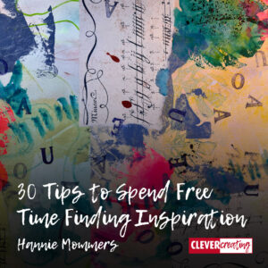
In this article, I give you 30 tips to spend free time in a creative way that gives you inspiration. It is a random list of all kinds of things I occasionally do. Get inspired.

Read more

Inspired by Flags: Red, White, and Blue in Pictures

Inspired by Flags: Red, White, and Blue in Pictures

A lot of countries have flags in the colours red, white and blue. The USA, the Netherlands, France, the UK – to name a few.

I looked for inspiration by sorting several of my photographs in specific colours. As a result, I made this article about red, white, and blue in pictures.

Thematic photography is an unending source of inspiration in my view. Try it yourself, if you want. Maybe the theme-spark will catch you as well. 🙂

Read more

7 Ways to Use Colour in Photography Creatively and Differently

7 Ways to Use Colour in Photography Creatively and Differently

Most people see the world in colour and although it’s also great to take pictures in black and white, colour can add a layer of inspiration and difficulty.

When we use colour in photography in a conscious way, we can guide the emotions of the viewer. Colour can create a dramatic atmosphere or a quiet one. Colour can also evoke approval or dislike.

In this article, I describe some of Itten’s colour contrasts applied in photography and I supplement it with a couple of other ways of using colour.

Read more