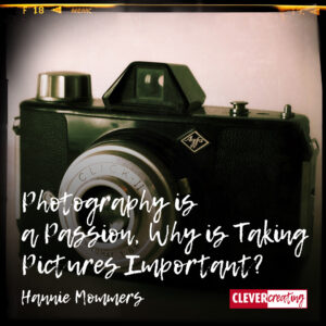
We saw a beautiful museum today. And with beautiful I mean the building. Modern. Raw concrete and zinc. Magnificent shapes.
Yes, there was art in it, since it was a museum of contemporary art. But too bad, the art didn’t mean anything to me.
Inspiration and creativity are must haves for me. Irregularly I make drawings, collages or mixed media in some kind of theme. It helps me keep my creative skills flowing. Here are a couple of examples:
An intermezzo is a short piece of music written to be played on its own or as part of a longer piece. For me it’s a welcome break in my daily activities.
What do you get your inspiration from? Tell me in the commentbox below.
On 5 February 2004 a group of 38 cockle pickers was surprised by the upcoming tide. Only 15 of them survived this disaster. They were illegal Chinese workers, most of whom were previously employed as farmers. Only two of them were fishermen.
The group had been signaled by British cocklers who tried to warn them. But the Chinese didn’t speak English and didn’t understand the tapping on the watches.
There had been an emergency call by mobile phone to the authorities, but probably due to the language problem the scale of the disaster was unclear at that time. Only one person was rescued by helicopter.
Fourteen made it back to the coast on their own.
Pictures, unless otherwise stated © Hannie Mommers
Chinese ceramicists on Aberystwyth Festival
The intro text could have been a newspaper article. Something like this most probably was written in the newspapers in the days following the fishing disaster.
If I would have read it back then, I would feel sorry for the 23 people, sigh, and read on. Because that is what I do when I read the newspaper.
But in 2009 I was at the Aberystwyth International Potters Festival. And there I saw a movie that made a huge impact on me. This film is made by Alex McErlain, Stephen Yates and John Davis and shows the installation that Victoria Eden has made as a memory to the 23 Chinese cockle pickers who died.
In my eyes this is a major function of art: reflecting on big events. It’s a tradition that goes from the victory columns of ancient Rome to the Veterans Memorial in Washington. Sometimes made as an assignment from the authorities, sometimes made as an impulse the artist had.
The only limit to your impact is your imagination and commitment.
–Tony Robbins
A stepping stone path to the families abroad. Photo credits: Victoria Eden ©
Victoria Eden’s installation is a meticulous piece of work. I can’t remember anymore how long the movie was, I just remember I was looking in awe at the incredible amount of work Eden has put into it.
One of the stepping stones. Each stone is screen printed with text or pictures.
Photo credits: Victoria Eden ©
In the film Victoria Eden hardly had any help, so I understood the effort it took her to make the imprints in plaster out of the sand!
The plaster was a mold for the ceramics stepping-stones she made. Each form has the name of one of the deceased on it and a quote about migration, loss and modern slavery.
The 23 stones were laid on the beach after finishing. The tide could wash over them and eventually all the stones would vanish.
Read and see more on Victoria Eden’s website
Recovering after the tide had washed over it, 1972, student project
Partly this monument appealed to me because I had done a beach project when I was a student at the Art’s Academy in Tilburg, the Netherlands. We made an imprint of the sand in plaster and because it was so big, we had a lot of difficulty getting the huge thing out of the sand and in an upright position.
And partly because I sympathize with those underpaid, invisible, hard working people that only tried to make a living.
I like the whole idea behind this monument of Victoria Eden. The idea of temporary life and stepping-stones to the left behind Chinese families. What do you think?
[bol_product_links block_id=”bol_56a8d94ceccc3_selected-products” products=”9200000040651095,9200000034011425,9200000047977692″ name=”monument” sub_id=”mag” link_color=”003399″ subtitle_color=”000000″ pricetype_color=”000000″ price_color=”CC3300″ deliverytime_color=”009900″ background_color=”FFFFFF” border_color=”D2D2D2″ width=”600″ cols=”3″ show_bol_logo=”undefined” show_price=”1″ show_rating=”1″ show_deliverytime=”1″ link_target=”1″ image_size=”1″ admin_preview=”1″]
My grandson is Spanish (and at the moment I write this he is 4 days old!). He is going to be raised bilingual. Spanish of course, since his mother is Spanish. And I thought his second language was going to be Dutch because of my Dutch son.
But his other language will be English. “How many people on the globe speak Dutch, Mum?” OK, I got it. It makes sense too, but still . . .
Yet I found the perfect solution. I gave my grandson a Dick Bruna book. It’s an alphabet dictionary, showing drawings with the English words and the Dutch translation underneath.
Originally Miffy is Nijntje.
Nijntje is short for Konijntje, which means Little Rabbit
Our first present for our first grandson
My friends all said the same thing: Buy the kid a Bruna book, it’s a big hit.
I am a graphic designer so I have known the work of Dick Bruna for a long time, professionally, but never looked at it as a potential gift for a grandson.
I love his style of illustrating. But it pleased me enormously to hear from my friends that little children love it too. And that is what counts, isn’t it.
Bruna’s drawings are always in four colors: the three primary ones, red, yellow and blue, and one secondary color, green.
The forms are always a variation on the square, triangle and circle. All in a very clear manner, with plain panes and thick black lines.
Two pages of the English-Dutch Miffy dictionary
Nijntje is called Miffy in English
Nijntje is short for Konijntje, which means Little Rabbit.
Bruna’s most famous character is Miffy – Nijntje in Dutch. He started drawing this figure when his own kids were small, being on holiday in the dunes of Holland.
The books are like Sesame Street. Meaning, they are very educational, but also very simple and appealing.
As I said, I love them! I hope my grandson will love them too.
Dick Bruna’s father had a publishing company. Although A.W. Bruna considered his son to be a black sheep in the beginning because he didn’t want to enter the publishing profession and dropped out of art school as well, Dick published his own books with the Bruna firm and illustrated a lot of other books.
Bruna is in his eighties, but he still takes his bike every morning to go to his studio and draw.
Update august 2014: Dick Bruna is now officially retired and won’t draw new books anymore.
Update february 2017: Unfortunately Dick Bruna passed away. RIP.
A second book we gave is about the square, triangle and circle
A nice touch is that the mother is now learning some Dutch as well !
[bol_product_links block_id=”bol_56a5f86eb0ff2_selected-products” products=”9200000025431791,9200000020392192,9200000022948084″ name=”nijntje” sub_id=”mag” link_color=”003399″ subtitle_color=”000000″ pricetype_color=”000000″ price_color=”CC3300″ deliverytime_color=”009900″ background_color=”FFFFFF” border_color=”D2D2D2″ width=”600″ cols=”3″ show_bol_logo=”undefined” show_price=”1″ show_rating=”1″ show_deliverytime=”1″ link_target=”1″ image_size=”1″ admin_preview=”1″]
I am an artist, with my focus on ceramics and photography. I do sometimes dive into other materials and other forms of art, but these two are the most important to me.
On previous occasions I wrote about my photography. And made several How-To-articles about ceramics, but here I want to introduce you to my abstract sculptural ceramic art.
Some explaining on the terminology:
– abstract = not recognizable as a real or figurative object
– sculptural = three-dimensional and monumental
One from the Avio-series: Avio 6, 30x30x30 cm
All pictures and works of art © Hannie Mommers
Avio 4, 28x28x24 cm
My parents didn’t allow me – being 16 at that time – to go to the Academy of Visual Arts, so I took a diversion by going to the Academy of Visual Education instead, where I got a teachers degree and could still educate myself, and later others, in art. My major back then was ceramics, my minor 3D forms.
As soon as I lived on my own and had a job, I could do what I wanted and attended evening classes at the Arts’ Academy, majoring in painting, thus ending up with two educations in fine arts. Which was a huge advantage, because now I became acquainted with different points of view regarding art.
<How I wish I had the time and the money for an artist in residence project at the EKWC in ‘s-Hertogenbosch in Holland. But as long as that is not the case, I keep myself satisfied with this wonderful book, full of techniques and examples.
(The book I have is for sale. Contact me if you are interested in it.)
Detail of Hanging in there, 11x12x32 cm
Because of my character and my schooling I am very inquisitive. On a regular basis I attend workshops on specific techniques and I love to try out new things.
A couple of years ago the Danish Barbro Aberg came to Holland to lecture and I got really inspired by her technique of mixing clay with perlite.
The obtainable perlite in Holland is much different from the Danish kind, so the outcome differs from Aberg’s result, but it got me so enthusiastic that I have been working a lot in the mix I learned to make then. I made some alterations of my own along the way to meet my needs.
Logic brings you from A to B, imagination brings you everywhere
–Albert Einstein
LisaSphere 1, 29x29x18 cm
I bought my perlite at a construction wholesale and tried a number of experiments before making the objects with it. The product that is available at some other stores is categorized in the garden-section, so it must have a different function than mine. It would be interesting to try this out.
From left to right: grog 0-0,5mm, red-firing ball clay, perlite
Perlite is used in Holland as isolation in fireplaces between the mantelpiece and the chimney pipe. According to Barbro in Danmark it has a way finer structure. Over here it’s pretty crude.
The proportions that I use:
My method:
If the paper mass is in a container for a long time, it goes moldy, but that will burn off in the kiln
What I love most of my own mixture is the beautiful skin it gives to the clay, which I emphasize by washing the work with a thin colored engobe after the first firing.
Detail of LisaSphere 2, 29x29x18 cm
Whenever I mix dry powders or when I make my slibs with oxides of heavy metals I have a mask firmly on my face.
Each substance that is burned can contain toxins, so I don’t enter my workplace when the kiln is on and I keep the door open during the process.
Better safe than sorry!
One in the geometrical series: LisaSphere 4, 21x22x16 cm
Some years ago I was exhibiting my work in Belgium and friends came by to watch. At the time I created a set of sculptures based on geometric forms and one of my friends thought it resembled crashed airplanes.
His remark triggered ideas about engines, blades and rotors. A lot of sketching was followed by a visit to the Aviodrome, a theme park about airplanes, where I was generously allowed to make lots of pictures.
Aircraft engines at Aviodrome, Lelystad, the Netherlands
Art is 5% inspiration and 95% transpiration
Chimney 10, 19x20x35 cm
I usually work in series. Sometimes working on one sculptural form leads to the next because I couldn’t quite achieve what I had in mind. Or I get ideas about the next one during the process. And sketching leads to several different ideas as well.
The series are for example: Chimney, Holding On and LisaSphere.
Significance
The aim of art is to represent not the outward appearance of things, but their inward significance.
–Aristotle
Holding On 2, 20x20x20 cm
Generally, when thinking of gardening, one will think of flowers for beauty and vegetables to eat.
But wouldn’t it be fantastic to see vegetation as a way to make your own colors?
As a ceramicist I am interested in the way colors are produced. I have been making my own colored slibs for years now, but writing my article about the coloring of clay aroused my interest in natural coloring in general once again.
I can’t garden myself anymore because of a back problem, but we have a public garden in my village with a tremendous explanation about all the features of plants.
Since the 70s Dutch Design is a major export article. And that design covers all areas, like graphic design, industrial design and architecture.
Some great schools were accountable for the high level of their students. To name a few: the Delft University of Technology, the Design Academy Eindhoven and the Academy for Art and Design St. Joost in Breda.
I had my education at the Academy of Visual Arts in Tilburg and at St. Joost, where I learned to have an inquisitive attitude. And it gives me a real boost if I see this spirit in others.
Ceramics on display at the museum Boymans van Beuningen
(Pictures are mine unless otherwise stated © Hannie Mommers)
Old-fashioned tiles at the exhibition ‘Hand Made’ in museum Boymans van Beuningen, Rotterdam, the Netherlands
Nowadays some young people think every item comes from the store or the factory. They see no connection with the soil or with the cultivation of the land. I once was at an exhibition of home spun wool and what I remember most of that exhibition is that one of the participants said she had discovered that sheep eat grass in the meadow!
Duh.
But of course there is also a large group of (young and old) people that want to live consciously in regard to the environment and consider how fragile our planet is.
When you are a designer and you are interested in sustainability you might want to do the same as this Dutch girl did. Lonny van Ryswyck decided to go back to the roots for her graduation project for the Design Academy Eindhoven.
An abandoned brick factory in Gilze, the Netherlands, is rebuild to a beautiful exhibition center
Armed with a bucket and a shovel van Ryswyck traveled through the Netherlands and scooped clay in different regions. These regions used to be areas of clay extractions for household and industrial purposes. For example Makkum, in Friesland, the north of the Netherlands, was famous for its tiles in the 17th century. Or Gilze, which is near my hometown, used to have large brick factories.
Clay consists of minerals with traces of metal oxides and organic matter. At each site the clay has a different composition, which will cause different colors and a different degree of shrinkage. Van Ryswyck did a meticulous examination of these disparities. She made a study of the composites, so now she knows what causes the colors.
She made molds for cups and saucers, thus making it visible that the shrinkage varies. The end result is a ceramic set with a beautiful variation of brown, ochre and white of which not one pair has the same size.
To top it off she stamped the names of the regions in the objects. You can imagine why I as a graphic designer and ceramist am so delighted with this project and its end products.
Beautiful sets of tableware by AtelierNL © Photography: Royal Tichelaar Makkum
Can green be commercial?
Quality comes fast, my father used to say
A couple of years ago I heard Lonny in a lecture. She is really passionate about her work and rightly proud of it. And I am so happy for her that a factory – Koninklijke Tichelaar Makkum – has taken an interest in her designs and has put it into production.
It’s not that hard to shovel your own clay and prepare it.
Have a look at how designers think.
It’s so great to leaf through design books and see all the marvelous products people came up with.
[bol_product_links block_id=”bol_56a745e128eec_selected-products” products=”9200000020904154,9200000002740871,9200000033090073″ name=”design” sub_id=”mag” link_color=”003399″ subtitle_color=”000000″ pricetype_color=”000000″ price_color=”CC3300″ deliverytime_color=”009900″ background_color=”FFFFFF” border_color=”D2D2D2″ width=”600″ cols=”3″ show_bol_logo=”undefined” show_price=”1″ show_rating=”1″ show_deliverytime=”1″ link_target=”1″ image_size=”1″ admin_preview=”1″]
My favorite Pop Art object is a Campbell’s tomato soup can that I use as a pen tray. I have had it for over 20 years, making the colors fade, but I have the picture to prove how red it used to be.
We never had Campbell’s in the stores over here and I didn’t know it actually was a brand of soup. When I was a student I was interested in the screen prints of Warhol from an Art point of view, but nowadays I am a graphic designer, which made my interest shift to the appearance of the logotypes and the industrial design.
Campbell’s Soup I: Tomato, c.1968 – by Andy Warhol
My family is working class. Nothing wrong with that, but they weren’t much into art. To say the least. So a whole world was opened up to me once I got art’s history lessons at high school.
So much so that I decided to go to art school, where I did a major in ceramics and a minor in art’s history.
Pop Art was a Movement that I liked instantly. I especially adored the Coca Cola bottles and the Campbell’s soup cans by Andy Warhol. But at that time I saw it solely as art.
Can you imagine my astonishment when I visited the States in 1991 and saw that same soup cans on the shelves in the supermarket just like that?
Duh, why didn’t I make the connection that Pop Art actually was about popular culture and mass production? I heard the words, I knew the explanation, but still…
One Hundred Cans, 1962 – By Andy Warhol
Warhol made screen prints. Thus his work could be reproduced in an edition, which made it possible to distribute it widely and (more or less) cheap. Consumerism at its best.
Pop Art originated from a particular zeitgeist and stood for freedom, sexual revolution and women’s empowerment. (By the way, these were not elements that my mother felt appropriate for me).
The movement was a powerful answer to the Abstract Expressionism of the years before. The artists had little appreciation for the serious nature and the museum mindedness of the Abstract Expressionists and wanted art to be for the ordinary people.
Queen Beatrix of the Netherlands, from Reigning Queens by Andy Warhol
It’s not just the soup cans I love. I like the portraits made by Warhol as well. This example is of the Dutch queen (did you know she didn’t change her hair style during her reign?).
Warhol’s silk-screens are flat pieces of color with little spaciousness. In this print emphasized by the rectangle in the foreground and the shapes in the background.
A silk-screen is made with as much prepared screens, as there are colors. Once the screens are prepared the printer can choose whatever color he or she wants. That’s the reason there are several versions of each portrait in different color combinations.
What is your favorite object of the sixties?
It took me some time to learn to appreciate the Dutch Vincent van Gogh as a painter. Until I realized I was merely being stubborn – everybody likes him, so I won’t. Very immature! So I tried to be open and studied his life and opinions about painting.
He wanted so much to be a good painter, to paint the inner souls of his subjects, that it literally drove him mad. Only a few people with vision appreciated him back then. Which is a pity, don’t you think?
Piet Mondrian, another Dutch painter, had my immediate love. He had the same drive as Van Gogh, but lived in a later timeframe, so his studied subject was different and his life was different. Where Van Gogh died a poor, ignored and troubled man, Mondrian experienced admiration for his work while he was still alive.