Why should a hobby artist care about the colour theory? Well, any knowledge that contributes to your toolbox is helpful and expands your possibilities.
In this article, I explain the difference between the colours on your screen and those of paint. I talk about Johannes Itten’s colour theory and give some tips about resources.
A colour theory for hobby artists is in my view just as important as for professional artists. Hopefully, it will increase your enthusiasm for your hobby.
Some of the links are affiliate links. As an affiliate associate, I earn a small commission when you purchase any of the products offered through the shared links at no extra cost to you. This helps me to maintain this website and I thank you for supporting me.
Table of Contents
A colour theory for hobby artists
Knowledge of the colours and their influence on each other is important for the professional artist but also for hobbyists. The main colour theory was developed by Bauhaus teacher Itten and is still helpful to this day.
The theory of Johannes Itten
At the Academy for Visual Arts in Holland, as a student, I learned the colour theory of Johannes Itten and I became a huge fan of Bauhaus.
The Bauhaus was a German educational institution for artists and unfortunately only existed for 13 years before its existence was made impossible by the Nazis.
Lots of famous artists have been teachers at the Bauhaus, like Piet Mondriaan and Ludwig Mies van der Rohe. And Johannes Itten, who developed a theory with a colour wheel. With this wheel, we learned to mix pigments and oxides to use in paintings and on ceramics.
Subtractive colour mixing
It wasn’t until I started as a teacher myself that I realized it was only one way of mixing colours – the subtractive way. The technically schooled boys in my class had learned about television screens that use the additive way of colour mixing.
The result was confusion on their part, but also on mine because I couldn’t understand why they kept making mistakes with the primary and secondary colours.
Well, we have a saying over here: want to learn something well and quickly, go teach the subject.
It’s true. And by the way, blogging about that subject has the same result! 😉
Colours in science and art
In the 19th and 20th centuries, several people developed a colour theory, even Goethe, the German writer. Most theories are based on the subtractive method. This is logical since there were no televisions and monitors back then.
Subtractive means that the more colours you mix, the more sunlight is absorbed (subtracted) and the darker the colour becomes.
The importance of colour theory is a greater understanding of the working of colours and their application. Itten calls it in his book Art and Colour, a colour theory about subjective experience and objectively learning to see colour as a way to art.
Itten arranged the colours in a circle so that their relationship was quickly apparent and based on which he could explain his 7 colour contrasts.
Related: 7 Ways to Use Colour in Photography Creatively and Differently
Itten’s colour circle
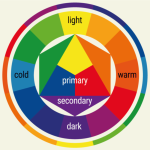
- Primary colours are red, yellow, and blue;
- Secondary colours are orange, green, and purple. These colours are a mixture of each primary pair
- red+yellow = orange
- yellow+blue = green
- blue+red = purple;
- Tertiary colours, which are a mixture of a primary and a secondary colour;
- Complementary colours. Those colours mixed together will make an almost black shade. They reinforce each other the most. On the colour wheel, they are opposite each other
- Yellow-purple
- Blue-orange
- red-green;
- The light and dark colours, with the strongest contrast between yellow as the lightest and purple as the darkest colour.
Seven colour contrasts
Colour-to-colour contrast
All saturated colours, of which red, yellow, and blue are the strongest. Pure, bright colours next to each other like the Mediaeval and the Expressionist artists painted.
Young children experience the pure colours first. That’s why illustrations in children’s books and children’s toys have these colours. A novice painter will usually start by using bright colours next to each other.
Light-dark contrast
Black-white (which are strictly speaking not colours) is the strongest contrast, as well as purple-yellow.
Where the colour-to-colour contrast is the simplest, the light-dark contrast is the most obvious contrast. Examples are Rembrandt’s etchings from the Baroque or the calligraphic drawings of ancient Chinese artists.
Related: Is Color Contrast Important on your Web Page?
Warm-cold contrast
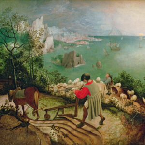
Red-orange as a warm colour against the cold blue-green is the strongest contrast. Tests show that people actually experience a red-orange painted room as warmer than a blue-green room.
A characteristic of warm and cold colours is that warm colours seem to come toward the viewer and blue colours recede towards the back.
Medieval painters already used this in their landscapes, where the main subject was painted in warm tones and the background went from brown via green to green-blue and spherical blue.
Complementary contrast
The colours that are opposite to each other in the colour circle are complementary colours. For instance, red-green, yellow-purple, or orange-blue. Complementary pairs enhance the colour of their counterpart the most.
Simultaneous contrast

An arbitrary colour takes on the hue of its complementary colour, for instance, grey within orange appears blueish.
Our viewing takes partly place in our brains, where we sometimes fill in things that are not really there. Like summoning the complementary colour even if it isn’t in an image.
Hence, photos sometimes look very different from what we expect because a photo is a direct representation.
It is important for the painter to know this in order to find an explanation if a certain hue cannot be made on the canvas.
Quality contrast
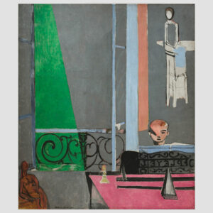
Colour quality is the degree of purity or saturation of the colours. The quality contrast is the contrast between saturated, bright colours and dull, muddy colours.
When a colour of paint is mixed with white or black it loses its brightness. Also, a colour can be made more indistinct by mixing a little of its complementary colour.
Colours lose a lot of their character when they are made muddy. A strong example is yellow, which when mixed with black becomes an olive green, dreary colour.
Quantity contrast
There is a lot of one or two colours compared to a small amount of another colour.
A flaw in Itten’s colour circle
You probably understand the way Itten arranged the colours. However, when you start mixing paint you will notice that the tones are not right.
That’s a flaw in the colour wheel. The primary colour red should be magenta and blue should be cyan. We know magenta and cyan from the cartridges of colour printers.
Ink and paint, the hues differ
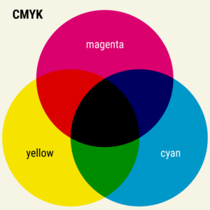
Oil paint, gouache, printing ink and toner cartridges are all based on the subtractive methods of colour mixing. But the shades will differ slightly because they all use a different medium: linseed oil, gum Arabic, egg.
The medium of ink is artificial. Not just magenta and cyan are different from what we have seen in the colour circle, even the yellow has a slightly different tone from oil paint.
Almost every colour can be made by mixing percentages of cyan, magenta and yellow. Mixed in even quantities those three colours will make a brownish-black. For a beautiful deep black a fourth cartridge is needed – black. It’s called the key colour, hence the abbreviation CMYK: cyan, magenta, yellow, key.
Even then, not all colours can be made by mixing CMYK. That’s why the better colour printers have a fifth, sometimes even a sixth cartridge.
Computer and television screens
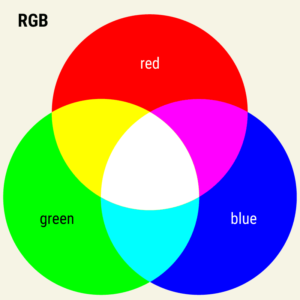
Mixing coloured light is called the additive method. The primary colours are Red, Green and Blue (RGB). This is the colour system used on television and computer screens. Mixing all colours – adding them – in even quantities will make white.
By the way, that’s another reason to call Black in the CMYK-system Key, otherwise, there would be confusion with the B of Blue in the RGB system.
As you can see in the picture above the primary colours of CMYK are more or less similar to the secondary colours of RGB and vice versa.
Knowledge about these two systems can help you when editing pictures in for example Adobe Photoshop.
Resources
If you know the colour theory well, you will notice that you make better, intuitive choices. While working with colour can be difficult at times, it is an interesting area.
There are resources on the Internet that will help you deepen your understanding of colour. A website I use a lot is Adobe Color.
Is colour an important part of your work? Tell me in the comment box below.
This article is an update. Originally published on 7-11-2012.


You cannot imagine how happy I am with Itten’s 7 (seven) colour contrasts! For years I’m collecting, what I call, Rules of Seven. Now I can add another Rule to my collection. Thank you so much.
It is not really fair, but I first looked at the pictures in your article. The painting of Matisse struck me at once as truly amazing. He uses so much grey in his painting, and yet the colours green, pink, and blue stand out. This must have been what he intended.
Then I read your explanation, Matisse used colour in a ‘quality’ way. Although I looked at the painting repeatedly for quite some time, I could not understand what you exactly mean by ‘quality’ in this case. Do you mean that the colours green, pink, and blue lose their brightness because there is so much grey in the painting?
Your explanations are as clear and entertaining as ever, so you should not take this as a critical assessment, yet I think I will need to read your article many more times to really understand how colour works and how it can be applied to a certain effect.
Hi Ruben. You really should have a look at my YouTube video “Inspiration starts at 7“. You will have some of the examples on your list already, like the 7 days of the week and the 7 holy sacraments, but there might be some new ones as well. 🙂
The ‘quality’ in quality contrast is exactly the opposite of what you thought. The saturated colours green, pink, and blue (the colours with high quality) don’t lose their brightness because of the grey tones, yet stand out more because of them.
If you have a chance, you should try to have a look at the real painting of Matisse. It is in the MoMa in New York. In reality, the grey parts have more differences between them than is visible in a reproduction, let alone in a web image. It’s unbelievable how much Matisse used his knowledge of colours in his paintings.
Thanks for your comment and compliments, Ruben, and enjoy the world of colour. 🙂
You are right, Hannie. Inspiration starts at 7. A closer look at many of my Rules of Seven often revealed that they were supposed to be eight.
I’ll give you 2 examples. The American communication scientist Linda Putnam explained in an article that communication and organization are isomorphs. They both mean the same. She proved it with seven metaphors, which were used in science to define communication as well as organization. Ten years later she wrote another article, and explained that it must be 8 and not 7 metaphors!
In 1999, above an interview with the American neurologist Ramachandran, the heading stated that the appreciation and the development of art are based on 7 uniform principles. Yippee, I thought, another Rule of Seven.
On closer examination of the actual interview, however, I found out that the editor made a mistake, Ramachandran mentioned 8 principles. This was confirmed in an article Ramachandran wrote with Hirstein in the “Journal of Consciousness Studies” Volume 6 (1999).
Since you’re so interested in art, perhaps you might like to know that in this 1999-issue, Ramachandrans’ and Hirsteins’ article was widely commented on. However, the debate went on in another series of this journal. In Volume 7, No. 8/9 (2000), the very well-known art scientist Gombrich commented on their article. As a consequence of all these comments, in Volume 8, No. 1 (2001), Ramachandran ‘sharpened’ his theory. The discussion ended in Volume 11, No. 3/4 (2004), this time not with articles about the visual arts but about music. All extremely interesting.
Ahh, thanks for the tip, Ruben. I am going to try to get a hold of these articles. Gombrich is a well-known name to me, as the first art history book I had to study, was written by him. 🙂
Take care and have fun.