There are good signs and there are bad signs. To know the qualities of good signs we just have to look around and experience the signage that surrounds us.
Don’t you agree that a lot of signs are confusing? Our environment is so full of messages, promotions, and both visual and auditory noise, that it’s hard to focus on the signs that we need at a specific moment.
Still, some signs are marvellous. In a way, it’s a pity that the better the design is, the less we notice the signs because they do their job instantly and without complicating things.
Table of Contents
The qualities of good signs
Good signage leads us the way in an almost unconscious way. Whether it’s letters on the boards or the design of devices that we have to operate.
One of my favourite topics: good signage

A well-designed item helps the user. Whether that design is a brochure, a coffeepot or a road sign doesn’t matter. When it’s designed properly, it doesn’t hinder or confuse the user.
Whenever I am abroad the first thing I look at are the signs. Both from the point of view of user-friendliness because I need to find my way, to being interested in the design.
- The signs on the airport if I come by plane (which BTW was far in the past because I don’t fly anymore for environmental reasons);
- The directions on the terminal if I am travelling by bus or train;
- The road signs if I drive a car.
In my opinion, too many designers would rather get a compliment about the appearance of their work than about the usability. It should be the other way around.
Related: Why is Choosing the Right Font Important to be Competitive?
Examples to clarify my point
Located nearby
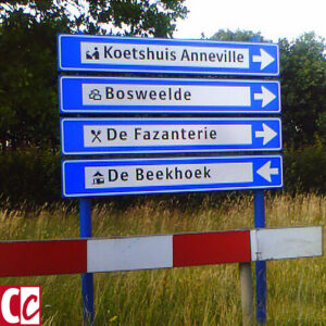
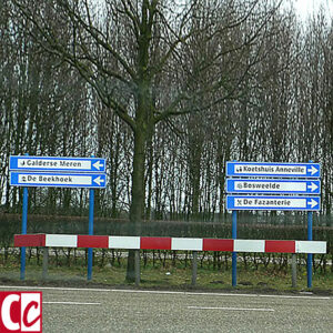
Decide in a split second. Will you go right or left for ‘De Beekhoek’?
For years this sign has been standing just outside my hometown at the end of the highway exit, giving directions to restaurants and campgrounds. It always annoyed me.
Imagine this situation:
You are on your way to a seminar in De Beekhoek, a place unknown to you. There has been a traffic jam so you are running late. The sign is at the end of the exit ramp. And while cars behind you are honking their horn out of impatience, you have to decide in a split second whether to go right or left.
I think you will go right, no matter which one of the four possibilities you need.
The cheapest solution would be to redesign the bottom sign as I did in the first image below. The best solution is to make 2 separate groups.
Driving abroad
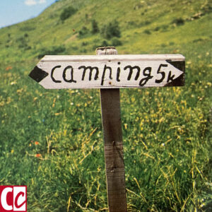
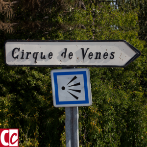
I saw both signs below in France while I was on holiday.
Despite our detour, because we couldn’t figure out the right direction for the campground, I had to laugh at the clumsiness of the sign. In its own way, it’s charming, don’t you think? Yet totally useless.
The sign to the viewpoint is better. The text is easy to read and the direction is clear. Pictograms can be tricky because it is a new language that has a learning curve. The icon for viewpoint is so widely used that probably most will know its meaning.
What makes a good sign?
- Simple design. Usability is more important than looks;
- Big letters to make it easily readable. Remember that many signs are seen while people are on the move;
- More spacious. A clear font becomes even clearer if the letters are spaced a bit more widely than usual;
- Use only well-known pictograms. Designers tend to think that everyone immediately understands an icon. However, like we needed time to learn the alphabet, learning the meaning of pictograms also takes time;
- Short, clear message. Don’t confuse people;
- Few colours with enough contrast;
- A unique look. When a sign blends into the environment, no one notices it.
My personal heroes, one Dutch, One American
Paul Mijksenaar
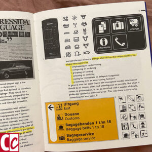
A great book on the subject of good signage is “Visual Function” by Paul Mijksenaar. He is the designer of the signage at Schiphol Airport in Amsterdam and JFK Airport in New York.
I once was able to invite Paul Mijksenaar for a talk at my yearly “Clients Cuddling Day”. He was amazing. He can go on and on about his ideas on signs in such a funny way that everyone thought they were attending a comedy night.
And the biggest accomplishment of that talk was that almost every client said to me later, that they just couldn’t look at things anymore without wondering what the designer had been thinking.
Donald Norman
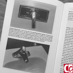
Thirty-some years ago I read “The Psychology of Everyday Things” by Donald Norman. And reread it, and reread it. Nowadays it’s lying on my desk permanently so I can leaf through it. It is one of the best books I have ever read. Ever.
This book looks slightly less attractive than Mijksenaar’s because it’s older and doesn’t have colour images. For me, this isn’t relevant, as you might have guessed because the content is more important than the way it looks.
The book has a chapter about faucets. Usually, I can figure out quite easily how a tap works, but during a holiday, driving through France, several of the parking lots had taps I just couldn’t fathom. I thought it was hilarious because it was one of those holidays that I was reading the book for the umpteenth time.
Oh, and by the way, those taps had to be handled with a foot pedal. Can you imagine? Very hygienic, yet, if one doesn’t know how to do it, a sign is needed for an explanation!
A design example from ordinary life
Ever since I put my husband’s car against a wall in an indoor parking lot, causing some big scratches, I hate public parking garages.
They’re too narrow, you can’t take the turns without damaging the car, and there are always cars parked across the lines so the spots get even smaller.
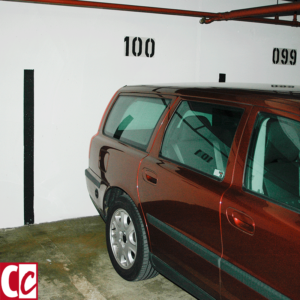
So this car park in Mönchengladbach, Germany, was a present and a revelation for me. The lines from the floor are extended on the wall, making it very visible if you are driving backwards where the parking lines are located.
How simple life can be! It is the full implementation of Norman’s and Mijksenaar’s principles. 🙂
Do you think graphic designers can make your life easier? Tell me in the comment box below.
This article is an update. Originally published on 15-04-2013.
