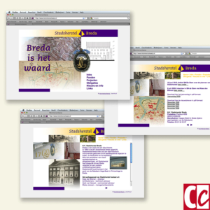
I was a graphic designer for 35 years, so I had to develop several technical skills over time. When I started in 1985 fax machines were quite new and there were no computers in the offices in the Netherlands.
Most printers had offset, although there were a few that still used letterpress printing. Designs were made on the drawing table. The design drawings were transposed by phototypesetting. And, we can hardly imagine this, there were no mobile phones, let alone the smart ones.
The main conclusion throughout the years was that the techniques may change, yet the rules of corporate identity will not.
Some of the links are affiliate links. As an affiliate associate, I earn a small commission when you purchase any of the products offered through the shared links at no extra cost to you. This helps me to maintain this website and I thank you for supporting me.
Table of Contents
- 1 The rules of corporate identity
- 2 House styles for all kinds of companies
- 3 Corporate identities
- 3.1 The logotype is more important than the image, the trademark
- 3.2 Form or shape is more important than colour
- 3.3 Colour is not that important
- 3.4 Note the adjacent colour
- 3.5 Use a regular font
- 3.6 Is it possible to increase or decrease the logo size without loss?
- 3.7 Readability is more important than nice looks
- 3.8 Corporate identities should last at least 20 years
- 3.9 Be mindful of sensitivities
- 3.10 Know the meanings of words
- 3.11 Do not use abbreviations
- 4 Designing for the future
The rules of corporate identity
Corporate identity is the total of logotype, design elements, fonts, colours and overall feel of the design of a company. Regardless of the technique used, a visual identity must remain similar and recognizable.
House styles for all kinds of companies

Corporate identity is the total of logotype, visual elements like lines or dots, letter fonts, specific colours and the overall feel of the design of a company.
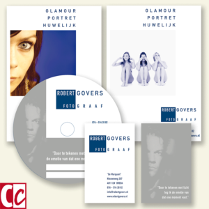
The most important parts of a corporate design are the website, the stationary and the company brochures. I put a website deliberately in the first place, even though I know that 30 years ago nobody had heard of a website. Things change in time!
Other components of a corporate identity are clothing and interior design. But also intangible matters such as customer service and behaviour.

People ignore design that ignores people
~Frank Chimero
Corporate identities

During my working life, I saw techniques evolve and vanish. Which is the reason I tried to make designs that worked well with every technique. Even techniques I had no knowledge of at that time, because they did not yet exist.
That is why I developed my own set of rules which concerned mainly but not exclusively with design.
The logotype is more important than the image, the trademark
I am fully aware that both text and image are called logos nowadays. To this day I am convinced that is a mistake. Logo comes from the Greek word for text.
A word logo is way more important than an image logo because speech is an important part of our communication.
Most companies are too small to build enough brand awareness to be recognized by the image. We won’t all grow to be Apple. Even big brands like Google and Amazon communicate with their name in text first.

An additional image is fine. Amazon has a smile. Google is big enough to sometimes portray its name in something else, although it will always be in the familiar colours.
Form or shape is more important than colour
As you can see from the logo collection, Jaguar is the least impressive one.
The designer has placed more importance on displaying metal than on a solid form. There now exists a black and white translation that is used on their website and that makes a much stronger impression.
Colour is not that important
I didn’t care about the colour a client of mine asked for, as long as it was not yellow and not a very light colour. No baby blue, light green, lemon or pink. At best as a secondary colour.
Mind you, I am talking about corporate design. I am not saying these colours can’t be used at all.

Colour is such a personal element and dependent on taste that the only thing you may need to consider is its symbolic value.
Related: What Are the Symbolic Values of Red and Blue?
Note the adjacent colour
Don’t put red and green directly next to each other, because of the colourblind people (1 in 20 men is red-green colourblind).
Years ago, a beer manufacturer found that colour-blind men could neither read the label on his beer bottles nor recognize his brand. The name and information were put in red on a green background. You understand that this was quickly changed.
Use a regular font
We distinguish regular, bold, thin, semibold, and extended letters. There are even more types, but my point is a normal letter is called normal for a reason.

Do not choose a really thin or a really black font as the primary letter for a corporate house style. You can use the varieties of semi-bold, bold, compressed, or extended, just don’t exaggerate.
Is it possible to increase or decrease the logo size without loss?
A logotype should be well designed, visible and readable on a pen as well as on the side of a truck. Often designers make the mistake to design a logotype for just the stationery and a website. Yet if a company grows there will be more occasions where a logo should be applied.
Of course, not every company will need a truck, but they might need a large flag or an advertisement on the side of an apartment building.
Readability is more important than nice looks
“Yeah, but I think that it’s beautiful.” Very often this argument was used by my clients to assess something. While that is not a valid argument.

Every communication expression must communicate, in which beautiful or ugly play a subordinate role. It is much more important whether a logotype or a text is legible.
Corporate identities should last at least 20 years
Large companies such as Philips or Coca Cola have their corporate identity even longer. This does not mean that their corporate identity is immutable. At times the visual identity is adjusted, but in such a way that the consumer hardly notices it.
Throwing away the built-up credibility on a whim because the competitor has this flashy new corporate identity is the worst thing a company can do.
Be mindful of sensitivities
There are different customs in different countries and if you work for international clients, it is necessary to know them.
Know the meanings of words
In the case of a fantasy name, try not to choose a name that has the wrong meaning in another language. For example, Rabo, a big bank in the Netherlands, means robber in Serbian.
Various car brands have gone wrong with their names. Mazda had a model named Laputa. In Spanish la puta means the whore. Fiat had a model named Marea. This means dizzy or nauseous in Spanish.
Do not use abbreviations
Abbreviations are not specific enough and make it very hard to build brand awareness with customers. BBC for example has too many different meanings.
Designing for the future
For a couple of years, I taught a class of 18 to 22 year-olds about usability and made one of my favourite statements: “You don’t design for today, but instead you design for the future”.
The resistance in the group startled me, my assumption being that young people were flexible. Still, I really think it is the task of designers to envision the future.
Nothing beats a new technique

It’s marvellous to experiment what the possibilities of a new technique are. Especially if you try to find out its limitations.
I had my first fax machine in 1988. It was a fax machine with thermal paper, the kind of paper that turned yellow right under your nose and smelled bad. What I loved was that sometimes it got stuck and the most beautiful patterns developed that way.
And it got even better when I deliberately pulled the paper in different directions. Sure, only a couple of years later there were computer programs like the one from Letraset that could do the same but I love handiwork at times, because of a certain kind of roughness one can never make in a computer program.

There is no design without discipline. There is no discipline without intelligence. ~Massimo Vignelli
My favourite work tool
I bought my first Mac, an FX-II, in 1991, being one of the first in my field to have a computer and use it. Don’t mention the price I had to pay for that thing!! I don’t want to think about that anymore. 🙂
Yet, this was another great tool to experiment with. As were tablets and smartphones later.
This is my main advice to present designers: Stay flexible and experiment a lot.
Do you think one can design for the future? Tell me in the comment box below.
This article is an update. Originally published on 11-07-2013.


As you explain corporate identity, to me it seems rather corporation-oriented. Once I read a book by the literature scientist Maartje Draak. The book is called Reception Esthetics. In her book, she explains how people appreciate literature. This is different from how most literature scientists explain what good literature is.
Although, perhaps your rules of thumb are based on the way people appreciate corporate identities?
Hi Scarlett, my 11 rules of thumb are based on my experience with what worked well and what didn’t. Appreciation has an influence, just less than you would think. After all, if someone has a business, he or she wants to communicate with present and future clients. In the end, the desired result is selling the product(s) he or she offers.
If you mean by corporation-oriented that only big companies should have a visual identity, I am sorry that I gave the wrong impression. Individuals who want to sell something can have a corporate identity as well.
I hope this clarifies your doubts. If not, let me know. Thanks for your comment and take care.
Hi Hannie. To me, designing and maintaining a corporate identity always seemed difficult and expensive. “Corporate” I always associated with big companies. And identity I saw as some classy stuff. Just as ‘image’.
However, in the way you explain it with some rules of thumb, even small organizations can be happy with such an identity. It’s even important for them. Although I think with all these different social media it is still an immense amount of work. And there’s a lot of technical knowledge involved. Don’t you think? Not everybody can manage this.
Discipline and consistent use of the basics is essential, I guess. Sometimes I think that good design shows the value of an organization and the values of the people who work there. Perhaps that is a bit of an exaggeration.
Not everybody manages a consistent use of their corporate identity. You are right there. Yet I disagree that not everyone can. In my view, it is always a matter of focus and the willpower to do something, not the ability. We can learn most things we put our mind to.
Good design indeed shows the value of an organization. Although companies can lie of course. They can have a green face to the outer world and be horrible to their own staff. Design only has so much influence. It’s the people who have to give meaning to it.
Thanks for your remarks, Maria. Take care. 🙂