Most people see the world in colour and although it’s also great to take pictures in black and white, colour can add a layer of inspiration and possibility.
When we use colour in photography in a conscious way, we can guide the emotions of the viewer. Colour can create a dramatic atmosphere or a quiet one. Colour can also evoke approval or dislike.
In this article, I describe some of Itten’s colour contrasts applied in photography and I supplement it with a couple of other ways of using colour.
Some of the links are affiliate links. As an affiliate associate, I earn a small commission when you purchase any of the products offered through the shared links at no extra cost to you. This helps me to maintain this website and I thank you for supporting me.
Table of Contents
Use colour in photography
Colour is emotion. We can direct that emotion through the conscious use of colour in our photos. One way to deal with that is to look at Itten’s colour wheel and get inspired by it.
The colour theory
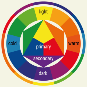
The people who know me personally or read my other blogs or articles have heard before that I am a huge fan of Johannes Itten, a teacher at the Bauhaus Academy in the twenties of the last century.
I use and used his colour wheel all the time. In the past when I was a graphic designer and a ceramicist. In the present in my photography. It became second nature.
Itten’s colour theory distinguishes seven colour contrasts.
- Colour-to-colour contrast. Pure saturated colours are strongest: red, yellow, and blue;
- Light-dark contrast;
- Warm-cold contrast. Red-orange against blue-green is the strongest;
- Complementary contrast. Red-green, orange-blue, or yellow-purple;
- Simultaneous contrast;
- Quality contrast;
- Quantity contrast.

#1 Primary and secondary colours
The most intense (= saturated) colours are the primary and secondary colours in their purest form. Children’s toys are often in those colours because they appeal to our sense of colour.
Occasionally I can make a picture that contains only the three primary colours red, yellow and blue or the three secondary colours purple, orange and green, although seldom with a saturation of 100%.
As hard as it might be, it’s nice to be on the lookout for the occasion.
#2 Complementary colours
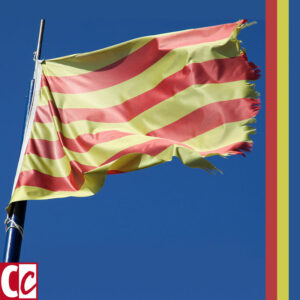
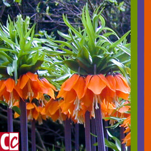
The colours that reinforce each other the most are the complementary colours. In the colour wheel, they are opposite to each other. They don’t necessarily need to be saturated colours, so these are not the only pairs. But it is obvious they are the clearest example. Yellow versus violet. Blue versus orange. Red versus green.
You’ll find complementary colours often in the plant world. Red geraniums with green leaves. A yellow violet often has a purple heart.


#3 Monochrome

Monochrome means in one colour with different shades of that colour. A colour can be mixed with white to make it lighter and with black to make it darker. It can be pretty difficult to make a picture that has only the tones and shades of one colour.
Another way to make a monochrome picture is by using a filter. There are several filters on Instagram you can use when uploading a picture. Hipstamatic has a lot of choices of black and white ‘films’ that are not exactly black and white but have a slight tone of colour.
Adobe Photoshop has a colour setting to create duotones. This is a combination of black and just one colour. In cyanotype printing, this effect is also attainable.
Related: How to Stay Inspired in Photography? Of these 7 Tips, I Particularly Like #6
#4 Colour splash
In iPhoneography, there are several apps to make a colour splash. Examples are Paletta for Android and Photo Splash photo editor app for the iPhone.
The picture is made black and white and where you put your finger on the screen the original colour will reappear. In some apps it works the other way around: you touch the screen everywhere you want it black and white.
You can also think of ‘colour splash’ as one little part of exuberant colour in an overall greyish photograph, giving you a lot of fun taking pictures.

#5 Warm and cold colours
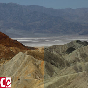
Look at the colour wheel and draw an imaginary line over yellow and purple. On one side are the warm colours, with reddish-orange as the warmest and on the other side are the cold colours with greenish-blue as the coldest one.
Medieval painters already knew that the use of warm and cold colours was a way of suggesting depth, the atmospheric perspective.
Warm colours tend to be closer-by and cold colours give the impression to be further away. Especially in a landscape, you can use this quality to realise more depth in your picture.
#6 Emotion in colour
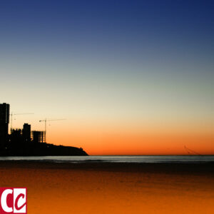
If you want a particular kind of atmosphere in a picture, colour can be a big attribute. It’s obvious in the first landscape below, but I suppose you can agree with me it’s even more visible in the second one. A sunrise is so romantic!
We all have a different sense of harmony. Some will abhor the combination of red and green, others will love it and immediately think of picturesque farmhouses with green shutters and red hearts on them.
The advertising world often uses this to draw attention to their products. Perhaps by putting colours next to each other that most people hate, such as bright red next to deep purple.
#7 The symbolic value of colours

In the Middle Ages, blue was the colour of Maria. Symbolizing pureness. The symbolic meaning is a matter of agreement. And can be different in another culture or another country. In the USA Democratic voting states are called the blue states, while in Holland blue is the colour of the liberal party.
In some countries, the colour of mourning is black, while in other countries it’s white or purple.
Related: What Are the Symbolic Values of Red and Blue?
Colour photography
When you are going to take pictures you could try to focus on one of these 7 ways of using colours. It’s so rewarding to discover the value of different approaches to colour once you practice it.
What do you focus on when taking pictures? Tell me in the comment box below.
This article is an update. Originally published on 1-02-2013.


I know the rules of the color wheel, but just realised that I hardly ever think about it when I take a picture… I focus mostly on the light and on the emotion. So I guess it’s method nr 6 then, emotion in color?!?
I will pay more conscious attention to my choices in the future: I took a lot of complementary colored photo’s without realising it, I just like the strong reinforcement.
Yes, I can imagine you taking complementary coloured photos for the brightness! The colours can enhance each other so much, making it really pleasurable to take a picture of. 🙂
Thanks for your comment, Klaartje, and keep on taking those lovely images.