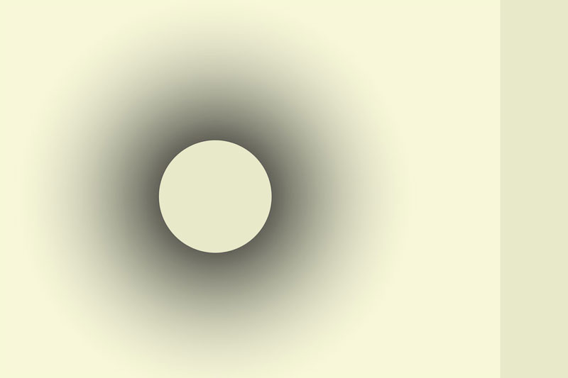
In 32 tips to get ideas to spend your free time is a pencil drawing of a shape, giving the optical illusion that the inner circle is much whiter than the surrounding white outside the circle.
A former colleague even made an airbrush in which the inside of such a form was darker than the environment, and still, it seemed lighter.
So I wanted to examine that. How much black can I add until the inner shape seems darker than the outer space?
It turns out that around 5 to 8% black may be added to the white before the effect is eliminated. Pretty much, isn’t it? It’s way more than I expected.
And in the example below you can also see how much influence colours and shades have on each other. The shape on the right side is the tint I used in the inner circle!

More optical illusions


An optical illusion: the grey of Adelson
Another great example is at the bottom of this article. I found it hard to believe my eyes that the colours A and B are exactly the same, but the proof is laid out in the video.
Related: Why Do Typeface Designers Use Optical Illusions?
Do you know other optical illusions that are remarkable? Tell me in the comment box below.

This weekend I visited a marvellous Escher Exibition in Kunstmuseum Den Haag – how many optical illusions would you like to see in 1 day, lol!
He is a marvellous optical artist, isn’t he? How long is this exhibition going to be? I hope to be able to visit the Netherlands this summer. 🙂
Escher in het Paleis is open year round. But this exhibition ends on the 12th of September:
https://www.kunstmuseum.nl/nl/tentoonstellingen/escher-andere-wereld
Great, thank you so much for the information!
Have fun. 🙂
You surprised me here. Just one example. Although a very interesting one.
But the links to your other articles made up for my disappointment. I need to go to Greece as well to see how those ancient architects understood our fooling eyes.
Perhaps there are examples of optical illusions in historic buildings in other European countries as well? There are a lot of old churches and other buildings with statues.
Interesting to know more about.
LOL, yes, you are right, Katelina, this was a very short post. Sometimes I just want a bit of information off my chest, and other times I want to tell a lot. 🙂
The optical illusions of the ancient Greeks were less understood by the Romans. That’s why the ancient Roman buildings are often a bit less awe-inspiring than the Greek ones.
The mediaeval sculptures understood more about perspective and distortion. So from down below looking up, it seems we see a statue of a saint, looking quite normal. But once the statue is on the ground and we can walk around it, it’s noticeable that the head is bent forward in a way that is humanly not possible!
There will surely be more examples, but I thought of this one first. 🙂
Thanks for your comment and take care.
You convinced me to look for more examples, Katalina. 🙂 So I have added more!