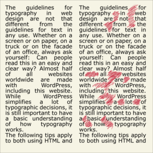
The guidelines for typography in web design are not that different from the guidelines for text in any use. Whether on a screen or on paper, on a truck or on the facade of an office, always ask yourself: “Can people read this in an easy and clear way?”
Almost half of all websites worldwide are made with WordPress, including this website. While WordPress simplifies a lot of typographic decisions, it is still important to have a basic understanding of how typography works.
The following tips apply to both using HTML and CSS, as well as WordPress or any other CMS (Content Management System) website.
Some of the links are affiliate links. As an affiliate associate, I earn a small commission when you purchase any of the products offered through the shared links at no extra cost to you. This helps me to maintain this website and I thank you for supporting me.
Table of Contents
Typography in web design
The design of font style on a web page is affected by factors such as font choice, size, colour, contrast, spacing and leading, alignment, layout, and other factors.
Visitor-friendly websites

It would help if you made it as easy as possible for visitors to find what they are looking for on your website. Usability is about clarity, readability, and convenience.
Readability has two definitions:
- One is about the text itself. Is the meaning of the words clear? Does the style support that meaning?
- The other definition concerns typographic design. Can you read the text? Is it easy to read the text?
Well-designed letter fonts
Do:
Choose a letter that is properly drawn and has a clear appearance on the screen. Fonts that are optimized for display on screen are for instance Tahoma, Verdana, Georgia.
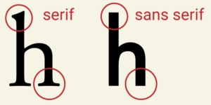
The difference between Tahoma and Verdana with Georgia is that the first two are sans serif letters and Georgia is a letter with serifs.
The quality of screens has improved considerably but not every visitor will use the latest state-of-the-art technology.
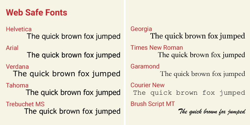
So while it is no longer necessary to use one of the so-called web-safe fonts, I would recommend choosing a font that is very similar.
Web Safe Fonts are the sans-serif fonts Helvetica, Arial, Verdana, Tahoma, and Trebuchet MS; serif fonts Georgia, Times New Roman, and Garamond; monospace font Courier New; and handwriting font Brush Script MT.
Do not:
Don’t think you can choose any font you fancy but try to imagine what kind of atmosphere you want to create. Letters have a character that says something about your business or the subject of your website.

For instance, don’t use script letters like Comic Sans for a business text. No one will take your text seriously.
In the past, when I received an invoice in Comic Sans (and you wouldn’t believe it, but I really did) my first thought was “Huh, when did I buy something in a toy store?”
Use a script letter for articles about illustration or comic books. And use them sparingly. Read this paragraph about manuals!
Choose the right size and version of the font
Do:
Serif letters are generally recommended for printed text because they guide the reader more naturally.
Screen font recommendations are not as clear as they could be. Tests, found on the internet suggest that Verdana is best for web use. Yet Microsoft, which is Verdana’s editor, usually initiated these tests. No surprise there. 😉
No matter what font you choose it is advisable to use the “normal” version of a letter. It is called “normal” for a reason! For parts of the text that need more attention, such as headings or quotes, you can take the bold or italic version.
You as an author have no control over the way the viewer sees your text on a screen. The viewer can adjust the size whenever they want. Yet it is wise to choose a letter that is not too large or too small.
A good starting point is 14 to 18 points. Fonts of a different family don’t have to look equally big in the same size. So depending on your choice, you have to test the result on a computer screen, mobile phone, or tablet.
Use this helpful website, Gridlover, to test different fonts and sizes.

Be aware that letters appear larger on a PC screen than they do on an Apple screen.
Do not:

Modified letters are more difficult to read. The extended, condensed, black or light versions are hard to read in the drawn version, but even more so if they are digitally edited. You can be sure to give your readers a headache if you do.
Some programs give the choices: x-small – small – medium – large and x-large. I strongly advise against the use of x-small.
Which colour is best?
Do:
There is little as personal and dependent on one’s own taste as colour. We often have a favourite colour, that influences our thoughts about the things we see.
Companies have corporate colours. They must be suitable for reading on a screen, otherwise, it is better not to use them for the text on your website.
Colour ensures recognisability if applied consistently. Try to adapt the colour choice to what the visitors of your website expect.
Related: Why Is Colour Important in Graphic Design? What Are Practical Applications?

Do not:
It is better not to put certain colours next to each other, because colour-blind people then have difficulty reading. Colours that have the same tone are especially problematic, like green next to red.
A good checking tool is to convert your website to grayscale. Is the contrast still big enough? Or almost squeeze your eyes shut and look through your eyelashes. That will give you a similar picture of the contrast.
An online resource for testing is the WebAIM contrast checker.
Related: How Does a Colourblind Person See the World? Be Considerate of Others.
Spacing and leading the right way
Do:

In texts, we distinguish letter spacing, word spacing, and line spacing. You can adjust all three, but some restrictions are recommended.
The line spacing or leading can be changed. Text with line spacing 1 often appears massive. A slightly larger value allows the eye to move to the next line more easily.
If the line spacing is too large, the connection in the text will be lost. Depending on the font, I would use 1.7 to 2 as the maximum.
Left-aligned text provides a quiet image with equal word spacing. Text is readable well if the overall impression is a plain ‘grey’, without darker or lighter concentrations.
A straight left margin makes reading easier than a centred or right-aligned text. If something needs to be emphasized or stand out, you can of course deviate from left-aligning.
Do not:
A well-designed font also has well-designed letter spacing, so I wouldn’t change that. The same applies to the word spacing, although it can be influenced by the alignment you choose.
The technique of lead typesetting required justified text. Those days are long gone, but still, a lot of people hang on to justified text.
Apart from being old-fashioned, the main disadvantage of block text is the appearance of “ditches”, which make reading very tiring for your eyes.
What do you want to emphasize?
Do:
Distinguish between the different parts of a text in a clear way. A heading in a larger size, or an intro in bold or italic for instance.
Contrast is a great way to draw attention to certain elements, such as a call to action button.

Do not:
If you want to scream, then PUT YOUR TEXT IN CAPITALS. Capitals or uppercase make reading difficult, so limit the use.
Pay attention to the width of the columns
Do:
Set columns at a sufficient distance from each other. For the width of a column, 10 to 15 words per line is a good rule of thumb.
Do not:
Don’t turn your blog or website into a tennis match. There are people who have a large screen (mine is 27”), which makes a broad column really annoying to read.
Consistency is key

Do:
If you’ve made choices for font, size, colour, etc, stick with that. That might get boring for you at some point. Just realize that you see your design every day, but your visitors don’t.
Compare it with the order of products in the supermarket. How annoying is it when you’re used to shopping, knowing the spots of your desired products, and all things have changed places?
You can use a font in different font weights. For example, normal for the plain text, italic for the intro, and bold for the headings.
But you can also use different fonts for various parts. Usually, a serif goes well with a sans-serif. Two distinct serifs or two sans-serifs are more challenging, though it’s certainly possible.
Related: What is the Best Font for a Website?
Do not:
Don’t turn your website into a fun fairground unless your target audience is children. Limit the number of colours and fonts.
Do you have tips of your own to add? Put them in the comment box below.
A lot of information doesn’t get outdated! This article is an update and was originally published on 7-11-2010.
Hm. You made me think, once again…
I guess I use the bold button too much.
And I better make a ‘template’ for the visuals of my blog, now I change the composition every time. (Too impatient, when I finally made time to write a blog again 😉 )
Thanks, Hannie!
Xx Kadanza
You’re welcome, I am always glad to inspire you, Kadanza 😀
Have you tried Canva yet? It’s a breeze once you have a couple of templates. I use it a lot nowadays! In the end it saves you a lot of time so your impatient nature will be happy 🙂
Happy blogging. xxx
Yes, I tried Canva and was happy with the results. but that was months ago, and then I forgot about it… This is my ‘problem’ in a nutshell I guess, no structure in place when it comes to blogging (yet?!)
I am very disciplined in my Virtual Assistant work for others, and while I am trading. I seem to save all my unstructured and impatient behaviour for blogging LOL
Hmm, isn’t that what usually happens? We care for others and forget ourselves. Blogging is mainly fun and thus less disciplined. I get that. 😉
Canva has an app for the phone as well, so you can work with it while you’re in the train or on the ferry!
Good luck, Kadanza.
I’ve never been aware of all the predesigned templates the big companies serve you until I tried to design my own website. NO WAY.
Okay, I thought, then I play some with the type of letters and the colours and the pictures. WRONG AGAIN.
My website looked like a scrapyard. I admit that some like to learn it the hard way.
Which is true. Most of the websites of big commercial companies are too slick for me. I always get the feeling they try to trick me out of my money. So I couldn’t copy them.
This is why your suggestions come in handy. I talked about them with a professional designer, and he said: “Do you believe every article you read on Internet?”
Then I showed him your article. “Oops, sorry,” he said, “This is a real pro. Trust me.”
From now on no more fooling around.
By the way, talking about fooling around. A couple of weeks ago I bought a new toothbrush. An ecologically responsible one of course. On the outside of the small light brown box, the lettering was light green. I couldn’t read anything of it. Eco-friendly design?
Thank you and I hope to read a lot more of these suggestions.
Thanks for the huge compliment, Alexandra, it’s much appreciated.
And I agree with you that sometimes lettering is not well thought through. From the idea that green stands for eco, there is a great temptation to use green for everything. But readability and user-friendliness also have to do with eco, so in the case of your toothbrush, the letters should have been black. There are plenty of options for using green on a package. In a decoration or drawing or something.
Thanks for your comment and take care.