Ligature has a lot of meanings. The word is used in music, medicine, and language. This article is about the meaning of ligature in typography.
If computers had been invented before the printing technique, I wonder if there would have existed ligatures the way they do now. I am so glad that my education in my youth included hand-setting loose lead letters.
This literally gave me a feeling of the typographic origin of corpses, leading and kerning, as well as ligatures.
Some of the links are affiliate links. As an affiliate associate, I earn a small commission when you purchase any of the products offered through the shared links at no extra cost to you. This helps me to maintain this website and I thank you for supporting me.
Table of Contents
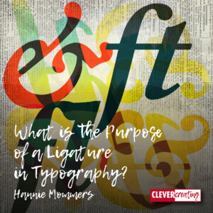
A ligature in typography
A ligature in typography is a combination of 2 or more letters into a new character. This had both a practical and an aesthetic reason.
Ligatures were an inspiration to me
My desk always was, and still is a mess. I’m really jealous of people who can clean up properly because that is a quality I lack.
So if you first see my desk, you won’t believe how precise I am as a graphic designer. I am great on the square millimetre.
I designed this brand for a special product of a Dutch video company. It’s a combination of a script font and a serif font. And has two ligatures I made.
Ligatures in typesetting
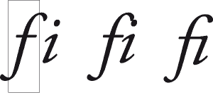
In the old days of lead typesetting, some combinations of letters caused big problems. The f, for instance, had a flag that hung loosely over the next letter, making it a vulnerable part of the letter.
If the next letter was i, the curl of the f and the tip of the i would clash against each other, which could demolish the f or the dot of the i. Such a letter pair was redrawn as a new symbol, called a ligature.
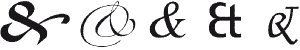
A well-known ligature in the Netherlands was the old florin sign fl, used to indicate the Dutch gilder. Other ligatures are:
- The character that is used in email addresses, the at-sign @, is a combination of a and t;
- Ampersand or et-sign & where the e and t are joined;
- The German sharp-s or Eszett ß is probably a union of the f and s to indicate that the pronunciation was different from the normal s.
In some fonts, the original letters of the ligature are still recognizable. Other ligatures are made for aesthetic reasons only, like st you can find in some fonts.
Ligatures as inspiration

Nowadays ligatures are not current. Computer typesetting does not require ligatures any longer. Although programs like Adobe InDesign give you a choice to use ligatures in your text.
I love combining old knowledge and new techniques, which is the reason I make ligatures myself sometimes.
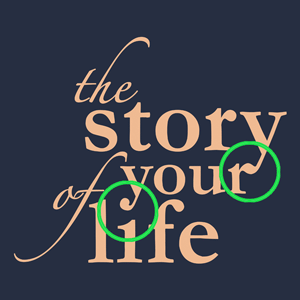
In “The story of your life” I have made a combination of the y in ‘story’ and the r in ‘your’. Both letters end in a little circle that I have redrawn into a new sign.
The other ligature is more difficult to discover: it’s a combination of the y in ‘your’ and the i in ‘life’. The dot in the i is made a bit smaller and fused with the tail of the y.

Precision work
As I stated at the beginning of this article: a graphic designer has to be precise. A lot of my work is often not noticeable. Adjustments I made in this logotype to make it balanced and natural-looking are:
- ‘the’ is positioned in a way that the e and the top of the t are nicely curving together;
- I shortened the flag in the first f so the space between the s, t and y is in balance. I didn’t want the transverse line of the f to collide with the l;
- The tail of the f is extended. There is now an imaginary horizontal line along the bottom of the f and life.
PS Look at the remarks of my client, he was very enthusiastic. 
A graphic designer’s little pleasures

It was tiny details like these that made my work such a joy. It’s funny that the best results emerged when the changes I made were so natural that they were barely noticed. That’s why I always made a sketchbook for the client to explain the whole process and show him or her the steps I took.
The sketchbook usually gave a lot of insight which made it easier for the client to go along in the process of several weeks during the hour the meeting lasted.
Related: 7 Do’s and Dont’s Using Text in a Blog or Website
Fun facts about the Dutch ligature IJ
Every language has its own alphabet. My alphabet, the Dutch one, has 26 letters. Spanish has 30, or maybe 27 because it seems that some letters are deleted by the Real Academia Española. English has the same number of letters in the alphabet as we have – 26 – but the z for instance is rarely used and the English pronunciation of a lot of letters is very different.
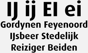
In Dutch, we have two peculiar letter pairs: the ij (which we call the long ij) and ei (called the short ei). The pronunciation of the two letter pairs is the same. I have tried to come up with an English word that has a similar pronunciation, but it’s hard. The i in wide maybe?

- The Dutch consider IJ as one letter. EI are two letters;
- IJ is an incomprehensible letter for a foreigner. That’s why the Dutch soccer club Feijenoord changed its name in 1974 to Feyenoord when they wanted to get international recognition;
- A lot of Dutch people interchange the IJ and the Y in their writing. I saw the typo ‘Gordynen’ on a shop window for years. However, the pronunciation of gordynen is much different from the pronunciation of gordijnen;
- The IJ is a true ligature, a new letter that developed from two letters that belong together. Microsoft Word has a hard time with that concept and will display the Dutch word for polar bear – IJsbeer – as Ijsbeer (and will constantly try to ‘correct’ the J);
- Even though IJ is considered one letter, it is not in the Dutch alphabet. So I can’t blame any foreigner for not understanding, can I?
The combination of i and j does exist in other languages. An example is Cortijillos, a village in Spain. Apart from the pronunciation being different, the letters i, j, and i are considered 3 separate letters.
Stedelijk Museum
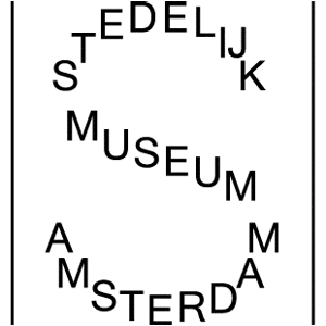
In 2012, I saw a documentary about the renewed Stedelijk Museum in Amsterdam. The general view was that a renovation of the building called for a new logo.
The managing director was an American woman, who clearly was given no explanation whatsoever about the ij in Stedelijk.
So when the new logo was presented to her, she thought that the I and the J were put together so the number of letters of Stedelijk would match the number of letters of Amsterdam.
I considered it a hilarious explanation, yet it also made me aware of how languages and views can be different.
Get inspired yourself
Once we know more about the origin and process of stuff, it is very inspiring to discover things ourselves. That’s why I visit lots of museums and read books on subjects I want to know more about.

When I still lived in the Netherlands I visited Museum Plantijn-Moretus often and the other day, I was thrilled to discover a biography about the founder of the original printing and publishing company, Christoffel Plantijn. (I am afraid it is not available in English, this was a Dutch book by Sandra Langereis, called De Woordenaar).
Now that I live in Spain I have the Printing Museum near Valencia on my bucket list.
Anticipation on a visit to a museum
It’s also fun to browse the internet for information. If you have no idea where to start or what to pay attention to when you visit a website or a museum, my ebook “How to get the most out of a visit to the museum” might come in handy.
>>>Download it here for free. <<<
Do you have any idea about ligatures? Tell me in the comment box below.
This article is an update of 2 former articles originally published in 2010.
Hi Hannie, I love this article! I had no idea about ligature till now. Okay, I know it as a medical term, but not typography. The Dutch language is not easy to learn, and I was also surprised about the “lange ij.” In German, we don’t have this letter as a combination. Now, I got used to it, and it is kind of normal for me. I went to university and learned about calligraphy in Chinese. It is beautiful to be busy with calligraphy. Thank you very much again for the education. I appreciate it a lot!
It’s funny, isn’t it, how ligature is a medical term as well. I didn’t know that until I was working on this article. Everyone has their own terms of profession, haven’t they?
I don’t think there is another language with the ij as a letter combination. It’s pretty hard if you have an ij in your name and you’re abroad. My Dutch friend who lives nearby has been living in Spain for over 50 years and still, every time she has to explain the ij that is in her last name.
BTW, she (and we of course) also has to explain every time she has only one last name. Every Spaniard has 2. It even poses difficulties in some automated processes!
That must have been such a great course, Chinese calligraphy. I suppose it wasn’t just theoretical but also practical? Marvellous!
Thanks for your comment and be creative.
Countries are so different. Very interesting that the Spaniards have two names. I have two as well but use my name. In Germany, we also have most time one name, but it is all changing because of the many different cultures.
Yes, Chinese calligraphy is fascinating! I love to do it! It was practical!
LOL, yes, like you, I could use my husband’s name as well. But since I am quite independent, like you probably, I also use my own name. That’s what I like about the Spanish names, most women don’t give up their own names when they marry nowadays. In the Netherlands, that’s more unusual.
Wat leuk om te horen Harry, dank je wel!!
Beste Hannie,
Een verhelderend inzicht in wat er allemaal door het hoofd van een vormgever gaat tijdens het creatieve proces. Niet (alleen) de ingevingen, toevalligheden en onnavolgbare gedachtenkronkels die je er normaal gesproken (vooral) bij verwacht, maar een zeer doordachte, rationele aanpak. Mijn respect voor jou is verder gegroeid!