Nowadays it is fashionable for fashion brands to put their monogram on bags and clothes. Why are monograms used that way?
A monogram is a powerful sign, made of 2 or a few letters, that is compact and recognizable.
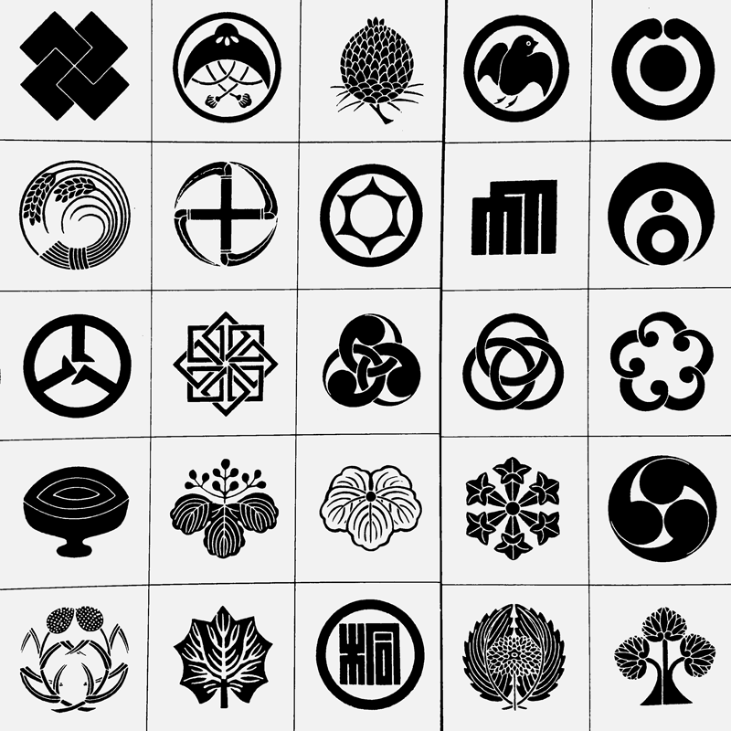
Monogram-like signs were used as early as ancient times. They could have a religious meaning or serve to identify the author or sender.
In the Middle Ages, royals and prelates used their monograms, consisting of letters of their first and last names. In the centuries that followed, artists signed their work with a monogram.
Some of the links are affiliate links. As an affiliate associate, I earn a small commission when you purchase any of the products offered through the shared links at no extra cost to you. This helps me to maintain this website and I thank you for supporting me.
Table of Contents
Why are monograms used?
A well-designed monogram ensures recognizability and has a stylish look. A monogram consists of the interweaving of letters. Unlike a vignette that consists of an illustration.
Monograms through times
People have always enjoyed decorating, including playing with the letters of their names. Sometimes hidden meanings were added to a monogram. Sometimes they were used to stamp in a wax seal or to brand livestock.
Monograms were not only a way for dignitaries to distinguish themselves, but they also symbolized status.
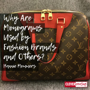
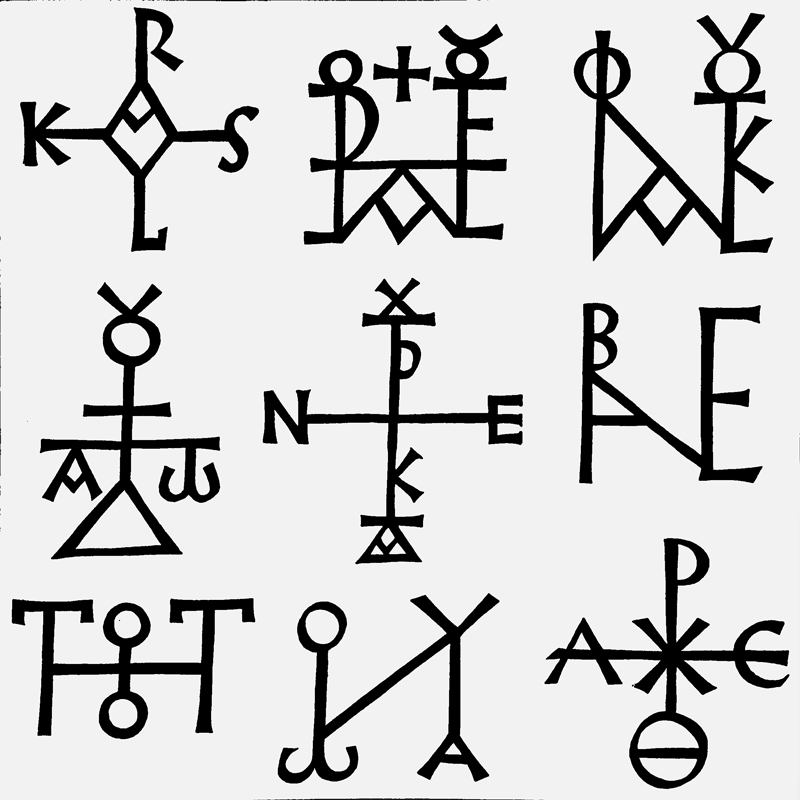
In the example here you see some very old monograms. The first one is of Charles the Great, and the last one of a bishop.
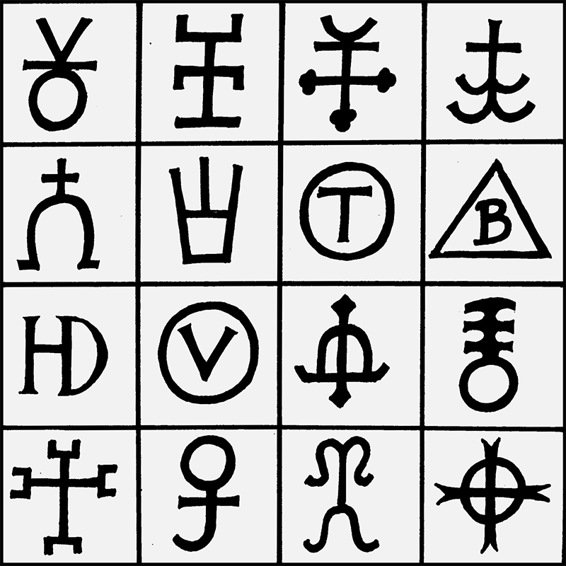
In brands for cattle, some used letters and others used symbols or graphic characters.
The other image show vignettes. A vignette is a picture, an identification mark.
Royalty and artists alike
In mediaeval times it was royalty and prelates that had a monogram. When artists weren’t anonymous workers anymore, from about the 14th century on, some of them used a monogram as well.
Weddings and fashion articles
Nowadays there are a lot of monograms in fashion. The printing houses and embroidery studios are also doing good business with monograms by respectively printing them on wedding invitations and embroidering them on household textiles.
Personally, I find the contrast funny, that some carry a bag with someone else’s monogram on it, while others have personalized cufflinks with their own monogram.
Contemporary well-known monograms are of Louis Vuitton, Yves Saint Laurent and Fendi.
An explanation of some examples

I wrote part of this article years ago and the cause was a cycling tour in Breda, the Netherlands! Can you believe it? 
Not that the cycling itself had anything to do with it, but whenever I’m on the road – even though I’m retired, I still do this – I look at signboards, billboards, and lettering on trucks.
Sometimes I see logotypes and monograms I immediately admire, sometimes I have an acute rejection. Yikes!
Related: Is Graphic Design a Good Career?
Typographic inspiration
I don’t believe in blindly imitating or copying anything somebody else made. But I do support getting inspired by others and modelling great stuff of others. That’s why it’s important to look around at what I see.
I get inspired every day, looking at pages on the internet, browsing through magazines, visiting Instagram and even outside watching the vehicle lettering and signs on the buildings. After all, typography is one of my main loves.

Real estate broker WIJ
My hometown Breda had a new real estate broker. Their name was Wij, meaning ‘we’, and yes, it had that peculiar ligature I talked about in another article. The only place where the letter ij exists is over here, in the Netherlands.
I hated the WIJ logo the minute I saw it. But why? I couldn’t get an immediate grip on that negative feeling. Therefore I had to analyse that logo and dig into my memory and archive for other images and letterforms.
Related: What is the Purpose of a Ligature in Typography?
A comparison
Here you see three different examples of monograms. The first is the Arts Academy Sint Joost, where I studied. The sign is probably from the seventies when abbreviations and exaggerated styling were hot. The second one is Hi, a brand of a national telephone company. And the third is the new one I saw of Wij.

STJ
Of course, you can question the readability of the Sint Joost monogram. The j might just as well be i. Or you can even see it as the letter u. And abbreviations are rubbish, they cause too much confusion.
But as a graphical character, the monogram is strong and balanced.
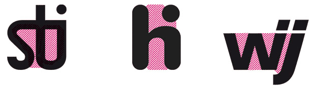
HI
I was a big fan of the design of Hi. It is a really strong graphical drawing. It is not an abbreviation, which is an enormous big advantage. Very recognizable and on top of that, it’s friendly: “hi!”.
In 2013, I wrote: “If the company is smart, they will keep both name and emblem for a long time, because it will not look outdated for quite a while.” They didn’t listen to me  and made an end to it in 2015.
WIJ
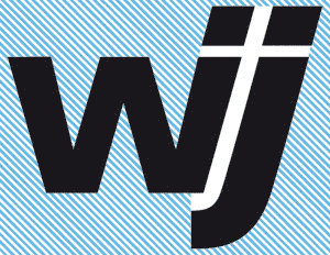
And then have a look at that awful Wij. The typographical term ‘negative space’ has a significant meaning.
Compare the negative space in the three vignettes. The trick is to balance it rightly. As you can see that is done totally wrong in Wij.
The oblique white cross that is created, gives an association they surely didn’t intend.
The j is broader than the i for no reason at all. I don’t understand why the designer made these choices.
Related: How is Negative Space Helpful for Designers and Artists?
Criticizing based on emotion or ratio
I had an initial feeling about Wij. That feeling came from experience, but telling people “I can feel that it is wrong” is not an argument.
I want to tell why something is right or wrong based on a rational explanation. And in the process, I sharpen my knowledge and my brain by gathering relevant information! After all, that is also why I called my project CLEVERcreating; using both the right and left parts of the brain.
Do you follow my way of thinking and can you relate to that? Or do you think it’s nonsense? Either way, I would like to hear it. Put it in the comment box below.
This article is an update. Originally published on 3-01-2013.