Typeface designers and graphic designers know that if they work mathematically and exact, everybody will think they are bad designers. They have to use tricks to make sure that designs are well-balanced.
In What are the Benefits of Negative Space for Designers and Artists? I explained the trick of negative space. In this article, I will explain how designers use optical illusions.
Some techniques require adjustments that might not be optical illusions in the usual sense but are nonetheless necessary. I will give an example of that as well.
Some of the links are affiliate links. As an affiliate associate, I earn a small commission when you purchase any of the products offered through the shared links at no extra cost to you. This helps me to maintain this website and I thank you for supporting me.
Table of Contents
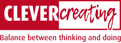
Typeface designers use optical illusions
Our eyes sometimes lie to us. They interpret straight lines as concave or convex, depending on the environment. To make the final impression, designers use optical illusions.
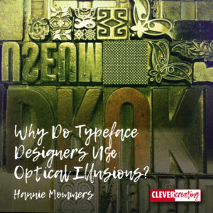
Greece in Ancient times
The builders in ancient times already knew it: Our eyes deceive us. Something that is exactly right in reality does not look right in our eyes.
This principle can be especially admired in the old Greek temples. The technique of building is absolutely spectacular. With drag slopes, slaves, and later cranes, the huge stone blocks were put in place. (Mind you, I don’t consider the use of slaves as a spectacular fact!)
But equally important is the insight that the Greek architects had in the way our eyes fool us. They took that very smartly into account. Although all directions in such a temple seem horizontal and vertical, there is not one exact straight line.
Parthenon-secrets
The course Perspective Sketching at the Academy in Tilburg, where I did my major in art, was given by a very enthusiastic man, always full of stories.
He had specifically travelled to Greece to gather evidence for the statement that no straight line in the ancient temples was really straight. He had put his hat on top of the stylobate (the last step of the base) and then walked to the other side.
And indeed, when he held his head close to the top step, his hat was no longer visible. The floor was slightly convex!
What is the link between Parthenon and typography?
A similar optical illusion occurs in typography. In the past, I have expressed my annoyance about the very bad lettering that can be found on some buildings.
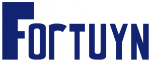
The example on the right could be seen at an office building in Breda, the Netherlands. The Fortuyn letters are made with a (digital) compass and ruler. If you compare them with a well-designed letter, it seems as if the straight lines run inwards. Especially the transition between curved and straight lines is bad.
Our box of optical tricks
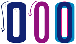
I guess you too can see that the thickness of the O in the curves is not correct. By using only a compass and not WATCHING, a mistake like this is easily made.
If I put both letters on top of each other, another visual trick of the typographer is clearly visible: round letters extend slightly further than the baseline. If the letter designer fails to do this, round letters seem to be smaller than straight letters.
Having the right knowledge increases our possibilities

If facade letterers have knowledge of these and other visual challenges in typography, they will make different choices. They can still choose to draw the letters themselves with a compass and ruler but would curve the vertical lines slightly. Or they can choose to use an existing font that is designed by a skilled professional.
Daily stuff for everyone?
Everyone uses letters nowadays. Our computers are packed with them. Fortunately, we do not have to design them ourselves because of the wide choice in our Word program or because we bought them in a FontShop.

Unless you want to design a logotype and plan to alter an existing font. Then this is the kind of knowledge you definitely need. As well as possible technical limitations of the digital world.
The risks of unprofessional application
Logotypes of renowned and old companies have a tendency to survive the fashion of the day. This requires not only a timeless and high-quality design but also a management that knows when to leave tasks and decisions to professionals.
Dutch companies like Philips and Hero have such logotypes. These designs are not carved in stone. They do change during the time to avoid looking outdated but this process is slow and usually done professionally and hardly noticeable for the outsider.
The Hero logotype

Have a look at the logotype Hero has had for over a century (!). It has 2 bold letters and 2 thin ones.
The designer didn’t use existing fonts and drew the letters himself. I don’t know if the alternation fat-thin-fat-thin has a meaning as well but I guess the r surely is an opened can with a raised lid.
Years ago, a director Hero ordered the design of two complete alphabets, one in bold and one in lowercase letters, that would seamlessly blend with the design of the logotype. Of course, as it turned out, the texts in those new letters were absolutely illegible.
Have a look at the piece of text that my former colleague HW Lohman made to see what I mean.
The illegibility was alarming, yet even more damaging was the effect on the logotype. The bombardment of similar letters made the 4 distinctive letters completely lose their strength and character.
An ordinarily used letter is called the ‘normal’ version of an alphabet for a reason!
If I had been in that designer’s shoes, I would have refused the assignment. Unfortunately, not every client appreciates such behaviour from a designer. So this attitude can be bad for your wallet in two ways: you are missing that specific job and you are likely to lose the customer. Or as one of my clients told me the other day: principles will not make you rich. 🙂
Unique designs should be valued
Somehow, a logo should be distinctive. As soon as there is too much ‘noise’ surrounding it, the value diminishes. It is capital destruction, even if that capital is immaterial.

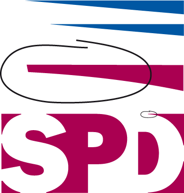
I made this logo for the SPD (Sociaal Pedagogische Dienst, a Dutch organization) years ago.
Soon after the introduction, one of the departments of the SPD wanted to have a logo of their own and asked another designer to make it. Unfortunately, I do not have an example to show, but I was completely shattered when I saw it.
Grrr, I hate it when designers don’t know what they are doing. I love my profession so much that I can’t stand shoddy work.
Related: How is Negative Space Helpful for Designers and Artists?

Use your eyes and know what you are doing
The new logo also had three letters and an alternation between positive and negative letters. So far so good. But the spacing was awful and the endings of the various parts were not adjusted.
When I made a design, I took into account the different circumstances in which a logotype would be used.
A logo should fit a truck or a big billboard. And must have the same powerful look when reduced to the size of a ballpoint pen. It is bound to be copied or scanned. A logotype must endure it all. A well-designed logotype can handle it!
The thing with digital design is that if the ending is too sharp you will never know where it ends up when resizing the form (blue example).
The SPD logo has 11 spots where it could go wrong! I have marked one in the example. I pay extra attention to such an ending by making it blunt, so that in each enlargement and reduction it stays in the same place.
In fact, it is no different from the lead letters era. Lead letters couldn’t have sharp edges either. They would break during the printing or even before.
Designing on the square millimetre
I often stated my profession is designing on the square millimetre. And of course, I know it doesn’t solve world food problems, making it relative as well but still, to me this was one of the nicest parts of my job.
Related: An Optical Illusion Plays Tricks with our Eyes
Can you relate to that idea or do you think it’s nonsense? Please let me know in the comment box below.
This article is an update of 2 former articles originally published in 2011.
I must say, Hannie, that the piece that your colleague did, Lohman, looks for me very chaotic. There is no balance in it. I need harmony for clothing, furniture, colors, and other things.
Very interesting how you describe your profession, and I understand you more now. Your SPD logo looks very beautiful balanced and quiet, clear. I love it! It is a pity that you don’t have the other one for comparison. I believe that enough designers don’t know how to do a good job. The ancient temples are magnificent. I am always amazed at how they have built the temples in that time. We can certainly learn quite a lot from them.
Thank you very much, Hannie! I will look at all kinds of buildings and logos differently. Very often, I feel disturbed but don’t know why. Your article has opened my eyes! 🙂
Exactly, Sylvia, the example Hans made is awful. I hope you understand it was on purpose to illustrate that a font face that is too much out of the ordinary is absolutely illegible.
Thanks for the compliment. The company doesn’t exist anymore, making it a pity the logo is no longer in use but I have always loved it myself as well. Sometimes one has favourites among her own creations and this one definitely is one of mine. 🙂
On one hand, it is indeed a pity I don’t have the bad one for comparison. On the other hand, I feel it would downgrade mine, so I might not have put it if I did have it.
Usually, the proportions are bad in a building that gives us restless feelings. It can also be the use of materials, the colour, or the size in comparison to ourselves. Optical illusions can help in experiencing a building but as you can understand, all the other elements have to make sense as well.
Thanks for your comment, Sylvia, and keep you eyes open. 😉
This was a very interesting read! Fascinating how the Ancient Greeks already knew this – but well, they already knew so much back then which we often still don’t seem to grasp today (but that’s another topic 😉 ) The example with the hat was interesting. If I ever get to Greece I will try that too.
I do not pay attention to such details in designs, but then, I’m not a designer. I pay attention to details in writing, but when it comes to designing I need professional help.
Everyone her own profession, you are very right there, Christine. 🙂
Details like the Greek temple make my profession so interesting, don’t you think? I am sure you can tell similar stories about writers that make them come alive to others.
Thanks for your comment and keep on writing!
I am afraid I am not much of a designer and a lot of this was over my head but I found the article to be very interesting. The “R” in “Hero” really does look like an open can!
I am glad I don’t have to create my own font types as I can see it would be very time-consuming. I honestly thought a computer did all the work of creating fonts! I did not know people were designing the fonts by hand. Makes more sense now.
I enjoy optical illusions in logos so it is cool to get some insight into how they are made!
Thanks for the remark that it was partly over your head. My intention is to write for laypeople like you, so I have to be more attentive next time. 🙂
And I can imagine you are glad not to have to draw your own letter font. I am too. There is even more good news: when I started working digitally, the free available fonts were really awful. If I wanted a properly drawn font, I had to buy it. And they were not cheap.
Understandable, since drawing a well-proportioned font could take a year or more, and typographers want to make a living too, but it made being a graphic designer very costly. Nowadays a lot of good fonts are available for free. And the paid ones don’t have that over-the-top prices anymore.
Thanks for your comment, Brianna, and I hope I changed your perspective on letters. 🙂