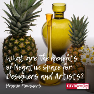
Negative space can indicate a toxic environment in relationships but that’s clearly not what I am talking about here, since this is a website about art and design.
In order to draw well, we must be able to observe well. Fortunately, there are tools we can use to do this. Using negative space is one of those tools.
In art school, I learned in the lessons of still life drawing that the negative space is as important as the objects themselves. I got a lot of advantages from that lesson in both model drawing class and typography class.
Some of the links are affiliate links. As an affiliate associate, I earn a small commission when you purchase any of the products offered through the shared links at no extra cost to you. This helps me to maintain this website and I thank you for supporting me.
Table of Contents
How is negative space helpful?
Negative space is a great help to learn to see relationships between one form and another. To be able to draw a 3D object on a 2D piece of paper, you have to represent your spatial perception and knowledge in a flat way. Seeing the negative space helps in that process.
What is negative space?
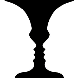
According to Wikipedia, negative space is the space around and between the subjects of an image. This implies emptiness.
I also consider negative space to be using the background colour to create a different image by painting around it. Which is an optic illusion as well as emptiness. This is used a lot in graphic design. This is called figure-ground reversal.
The best and most known example is this image of a vase, in which you can also see two faces. Focus either on the white or on the black of the drawing.
The use of negative space in design

SPD Breda
In my graphic design practice, I used negative space in my designs a lot. For example, in 1990, I made this logotype for the organization Sociaal Pedagogische Dienst.
I usually started with an existing letter font and edited that in the design process. In this particular case, there were some interesting design problems I had to solve. You can read more about that aspect in another article.
The space between the P and D presented an additional difficulty. Since the background below the P is attached to the D, the D should not be too far from the P.


FedEx
Once we are keen on observing the negative space as well as the objects themselves, we can discover a whole new world. Despite the fact that I call myself a skilled viewer, I had never seen an arrow in the Ex of FedEx!
It wasn’t until I was looking specifically for negative space examples in design, that my eye fell on that phenomenon.
Carrefour
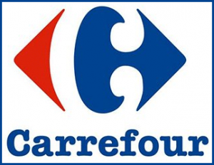
Have a look at the logo of the French supermarket Carrefour. Besides the obvious arrows pointing to left and right, there is another thing I thought is interesting.
On the internet, I saw several ways the word and the image are combined. In the first example where the word is below the image, and the whole thing is pushed into a too-small rectangle, I have a hard time seeing the negative C. Even if the letter is not actually present it can’t be cut off like that. In my opinion, that’s a designer’s mistake. 🙂

In the second example where the word is put next to the image, but also with much more space around it, the white C is far more obvious, don’t you think?
(I added this part about Carrefour after the remark of Rein the comments).

A useful help when drawing a still-life
In graphic design, the figure-ground reversion is mostly used. While drawing, the emptiness around objects is more obvious to use.
Although beautiful and very early examples of the first use of figure-ground perception in art are the hands drawn on cave walls.
Vases and bottles
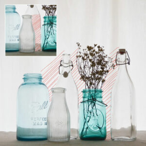
In this example, I’ve shaded the negative space between the bottles. It’s probably clear what is meant even without the shading, right?
Hence the insert with a shading of the space on the third bottle. This is also a negative space but is often neglected because it is less obvious. You can enlarge the image by clicking it if it’s not clear enough.
Human body
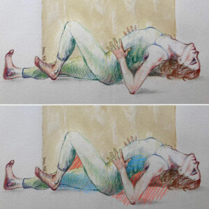
Not only during my studies at the Academy of Arts but also as a designer I often drew the human body. Both from photographs as live models.
I regarded that as exercises, like a musician playing scales. Very useful for keeping a close eye on things and paying attention to proportions.
In the example, I have shaded the clear negative space with red. As with the bottle still life, there is more negative space that can be helpful, which I shaded in blue.
Have you ever used negative space in your work? Tell me in the comment box below.
This article is an update. Originally published on 12-06-2010.

Hi Hannie,
Again you wrote a very insightful article. I work a lot with designers and artists. But they must have kept this ‘empty space’ secret for me. This is the first time I read about it. At least when it comes to art and design.
In literature, another one of my preoccupations, ‘empty space’ is a very common practice. Poets and novel writers use it for several purposes. For example, often many everyday and obvious types of behavior, such as washing, going to the toilet, eating, and drinking are left out. When a novelist would reproduce all human actions, no matter how detailed, his or her books would become very tedious.
The use of time in a novel is also a way to emphasize specific activities. Most of the timing of a novel is ‘empty space’ because it’s left out. Even when a story does not last for more than a couple of hours, most of this time is left out. The bigger the timespan of a novel, the more time is left out.
Poets are great with empty space. They use metaphors to express how ‘empty’ all other meanings are. Take for instance this key sentence from a poem of the Anglo-American poet Auden: ‘Bring in the coffin, let the mourners come.’ This is no doubt a reference to a very serious event. Yet in the poem, it is unclear what happened to who and when.
Positive-negative is also often used by poets and novelists, to express contrasts between spatial environments, protagonists, and activities. However, figure-ground-reversal is a less common practice in novels. In poems, it’s often used. Often, poems can be explained from various opposing viewpoints.
As you can read, you wrote a very inspiring article. It reminds me to read poems and novels more carefully.
Thanks again.
This is absolutely marvellous, Richard, thank you so much! You opened my eyes as well. I never made a connection between negative space in art and negative space in poetry and literature. LOL, I have to read more poems now as well. 🙂
This is very interesting, Hannie! I have never heard before about negative space. Reading your article has given me great insight, and I understand it now very well.
I think graphic design must be a lot of fun. Using your creativity creates unique designs, and studying art opens the mind.
I only noticed the arrow in FedEx now because you pointed to it; I have never been aware of the arrow. Funny! Of course, I often saw these images where you get two different pictures, but I didn’t know this is a positive and negative space. Very interesting! I learned something new! 🙂
It’s like discovering a whole new world, isn’t it, Sylvia? And you’re right, I really had a lot of fun when I still had my graphic design studio. Occasionally, I still design stuff of course, but never anymore for paying customers. This adds to the fun because, to be honest, customers didn’t always want something new and unexpected, even though they asked for it. 🙂
Did you ever notice the line below the Amazon logo is a smile? Nowadays it’s more obvious because they use the smile at times separate from the logotype. Not negative space, of course, but also something I only noticed because someone pointed it out to me!
Thanks for your comment and I am really glad I could teach you something. 🙂
Grappig, ja. Ik had er helemaal niet meer aan gedacht, maar ik had inderdaad ook die associatie in het begin!
Waarnemingsillusie: en zo kwam ik er pas héél veel later achter dat de 'richtingaanwijzer' naar de Carrefoursuper geen pijl was, maar een uitgespaarde C. Carrefour gebruikt in Frankrijk haar logo trouwens op borden met soms een pijl er onder die de tegengestelde rijrichting aanwijst… Dat hier in Belgie veel klanten van dat concern de weg kwijt zijn, en C-medewerkers hun baan, zou dat er mee hebben te maken?
Rein van Gisteren