Fonts have a look that tells something about the character of the person or company that chose them. For me, that has always been the main reason for the letter choices I made for a client. What should their appearance be?
But fonts have more aspects that influence that choice. It is important to know them in order to choose the right font.
While beautiful or ugly is one of those arguments, it is the least important of all. So, why is choosing the right font important?
Some of the links are affiliate links. As an affiliate associate, I earn a small commission when you purchase any of the products offered through the shared links at no extra cost to you. This helps me to maintain this website and I thank you for supporting me.
Table of Contents
- 1 Why is choosing the right font important?
- 2 The importance of letter fonts
- 2.1 Communicates about the character of a business or person
- 2.2 Demonstrates professionalism (or not)
- 2.3 Initiates awareness and reputation
- 2.4 Legible font makes it easy for the viewer/reader
- 2.5 Creates a logical structure in the information
- 2.6 Expresses an emotion or mood
- 2.7 Engages the audience
- 2.8 Helps in pleasing the eyes
- 2.9 Attracts attention
- 3 Is it really that important to choose the right font?
Why is choosing the right font important?
No one is in business for their beautiful looks. We’re in business to be successful, either in making a living or in having an influence. The choice of letter fonts helps in our general appearance to gain trust and to appeal to the right target audience.
The importance of letter fonts

My clients were always very inclined to judge whether they thought my designs were beautiful or ugly.
Even though that is understandable – after all we are mainly visually oriented and react strongly with our emotions – time and again I tried to make it clear to them that it was not about what they thought was beautiful or ugly, but about what their target group thought.
The basic question is always: what do I want to convey with my design and what role does a font play in this?
Here are 9 aspects to take into account.
Communicates about the character of a business or person
A construction company or chemical concern calls for a different font than a perfumery or an ecological store.
Demonstrates professionalism (or not)
Sometimes you want to radiate professionalism. At other times, you don’t want to stick out too far above your audience.
Compare tabloids with opinion magazines.
Gossip magazines have a messy layout and photos that seem to have been taken in a hurry. The letters have all kinds of shapes and colours.
Opinion magazines have a calm layout with lots of white, classic fonts and stylish photos.
The tabloids may have more budget than the opinion magazines, but they want to present themselves as equals, while the opinion magazines present themselves as experts.
Initiates awareness and reputation
By using a fixed set of fonts, you create recognition among the target audience. Combined with the other actions of the company, this establishes a good reputation.
Legible font makes it easy for the viewer/reader
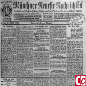
A combination of appearance, colour choice, and contrast determines whether letters are readable or not. Don’t make it too difficult for your audience by choosing a funny font, but choose a legible one.
Related: Why Is Colour Important in Graphic Design? What Are Practical Applications?
Creates a logical structure in the information
Letters come in all shapes and sizes. By choosing serif or sans serif, large or small, extended or compressed, bold, italic, or normal, you can easily create a hierarchy in a text.
Expresses an emotion or mood
Not only the content of a text but also the layout and the choice of letters convey a desired emotion or feeling to your target audience.
Engages the audience
A very specific niche will require a different choice of font than a broad target group. People like to be part of a certain group.
Related: What are the Rules of Corporate Identity that Can Stand the Test of Time?
Helps in pleasing the eyes
Even though I always say that beautiful or ugly is absolutely unimportant, the eye wants something too. Of course, it is an aspect that counts as well.
Attracts attention
Used correctly, letters have a lot of expressiveness.
Related: Why Do Typeface Designers Use Optical Illusions?
Is it really that important to choose the right font?
I ran into an interesting article by Hyunjin Song and Norbert Schwarz entitled “If it’s easy to read, it’s easy to do, pretty, good, and true.” Both scientists were connected to the Psychology Department at respectively Yale University and the University of Michigan.
For years, they have been researching the perception of people on written assignments and you understand, to me as a graphic designer, their research was really interesting.
Simple versus complicated font
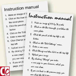
Song and Schwarz have shown tutorials to test persons. The accompanying question was: “Estimate how complicated the task is and how much time it will cost”.
The test persons assumed that the task set in the difficult to read Mistral would cost twice as much time as those set in the easy-to-read Arial.
With this result at hand, as an entrepreneur, you can benefit in several ways from this knowledge. After all, one way or another, you as a font user want to achieve something from the viewer.
Related: Fascinating Facts about Fonts and how to Choose the Right One
Make it easy for your customer
The mistake many graphic designers and the customers of the designers make is that they initially react to how beautiful they think a font is.
But those customers are in business to make money and if they do that by using an ugly font, tell me what the right choice is?
If you want the visitor of your website to respond to a call to action, put it in an easy-to-read font.
If you are explaining something about a topic that people usually consider to be very complicated, use an easy to read font.
Enhance your expert status
On the other hand, there can be reasons to do the opposite. Choose a complicated font if you have a reason to make users believe that a task is complicated.
If you as a restaurant owner want to give the impression that the dish on your menu is complicated to make and takes a lot of time to finish, use a complicated font! People then accept a longer wait before the food is served.
Colour contrast
Another aspect that Song and Schwarz looked at was truth in combination with colour contrast.
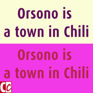
They showed the statement “Orsono is a city in Chile” to the test persons with the question: Is this true or not?
The statement was shown in both a well contrasting colour pair and a colour pair with very little contrast. The test persons accepted the first example more often as true than the second one. (By the way: the statement is false. It’s Osorno and not Orsono.)
Repetition is the mother of all studies but has even more effects
We people need familiarity in order to function. We accept unknown issues and new experiences if they are not too far out of our comfort zone.
Song and Schwarz investigated that aspect as well. It was already clear from the other aspects of their research, that simplicity and clarity have a big influence. But they also discovered that repetition increases familiarity. And with that the acceptance.
Something we know ourselves of course because we experience the bombardment of repeated advertising messages daily. The more we see the ads, the more familiar they become, and the more we accept them. Even if we hated them at first.
Worth the effort
On this webpage is a pdf link available at the bottom of the article. There you can read about other aspects of the research. For instance the perception of difficult to pronounce names versus easy to pronounce names. Or how the ticker symbols influence people in their decision to invest in that company.
By the way, I wonder why that website is difficult to read. The page is very unattractive, there is too much text without headlines or white space, and the leading is too small. Would that be because the sender wants to suggest this is the website from an expert or is it a coincidence?
Anyway, the biggest eye-opener for me – being an apostle of readability – was that a restaurant could use a more difficult to read font to give the cook a very knowledgeable and expert status. That was new to me.
Do you see more applications for easy to read or difficult to read fonts? Let me know in the comment box below.
This article is an update. Originally published on 3-09-2015.



Great article. Can I check with you whether these are the rules of thumb you suggest?
– Determine your target group.
– What do you want from the target group?
– Is the target group okay with that?
– What is your company?
– How do you want your company to appear?
– What is the feeling of familiarity you want to convey?
You also address some technicalities. Such as easy to read, nice to the eye, attention sensitive, and be aware of colour contrasts.
You suggest some rules of thumb. Which are not that easy to assess I guess, but perhaps you can elaborate on that issue in the future?
Wow, you really studied the article, Klaus, marvellous! I can agree with your list except for one aspect, ‘company’. I have tried to elaborate on the fact that it is not only about companies but also about individuals, such as professionals or artists.
I’ll surely will take up your suggestion to write more about this in other articles. 🙂 Thank you so much and have fun.