Why Do Typeface Designers Use Optical Illusions?

Why Do Typeface Designers Use Optical Illusions?

Typeface designers and graphic designers know that if they work mathematically and exact, everybody will think they are bad designers. They have to use tricks to make sure that designs are well-balanced.

In What are the Benefits of Negative Space for Designers and Artists? I explained the trick of negative space. In this article, I will explain how designers use optical illusions.

Some techniques require adjustments that might not be optical illusions in the usual sense but are nonetheless necessary. I will give an example of that as well.

Read more

An Optical Illusion Plays Tricks with our Eyes

An Optical Illusion Plays Tricks with our Eyes

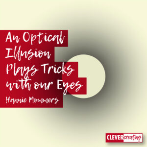
In 32 tips to get ideas to spend your free time is a pencil drawing of a shape, giving the optical illusion that the inner circle is much whiter than the surrounding white outside the circle.

A former colleague even made an airbrush in which the inside of such a form was darker than the environment, and still, it seemed lighter.

So I wanted to examine that. How much black can I add until the inner shape seems darker than the outer space?

Read more