A Helpful Colour Theory for Hobby Artists as a Thorough Foundation

A Helpful Colour Theory for Hobby Artists as a Thorough Foundation

Why should a hobby artist care about the colour theory? Well, any knowledge that contributes to your toolbox is helpful and expands your possibilities.

In this article, I explain the difference between the colours on your screen and those of paint. I talk about Johannes Itten’s colour theory and give some tips about resources.

A colour theory for hobby artists is in my view just as important as for professional artists. Hopefully, it will increase your enthusiasm for your hobby.

Read more

What Are the Symbolic Values of Red and Blue?

What Are the Symbolic Values of Red and Blue?

Years ago I was watching the elections in the States and I noticed that red and blue had a symbolic value for the political parties.

So they have in the Netherlands, but the funny thing is it has an opposite meaning. The US Democrats are blue and the Conservatives red. The Dutch right wing is blue and the left one loves red.

As I am interested in every aspect of colour, I decided to look more closely into the symbolic values of red and blue in general, not just in politics.

Read more

How to Improve the Colour Quality of your Printed Pictures

How to Improve the Colour Quality of your Printed Pictures

The quality of the printers is improving fast. Nowadays a lot of colour printers have more than four cartridges, making sure all the tones are printed. 

Yet, the extra cartridges are grey or black, never a colour, which means there are still colours you see on the screen that can’t be printed on paper.

Taking pictures and printing them on your colour printer can be disappointing. Sometimes the result is NOT what you expected. I’ll give you the reasons for that disappointing result and whether you can improve the colour quality of your precious photographs.

Read more

How Do Colours Affect Each Other and What Can We Do with this Information?

How Do Colours Affect Each Other and What Can We Do with this Information?

One of the best books in my private library is “The Art of Colour: The Subjective Experience and Objective Rationale of Colour” by Johannes Itten, a teacher at the Bauhaus who I admire so much. 

Of course, Itten’s notions are only one way of looking at colours. Many researchers, artists and scientists have constructed a colour theory as well. But logically, as a designer and artist, I have a strong affinity with a fellow artist.

Itten explains the reality of colour and the way we as humans perceive colours. Colours affect each other. That influence is an action of our brain. “Eye and mind can only by comparison or contrast come to a clear perception.” 

Read more

Why Is Colour Important in Graphic Design? What Are Practical Applications?

Why Is Colour Important in Graphic Design? What Are Practical Applications?

Colour has a big influence on us. Colour sets our mood and is a way to express ourselves. Colour has a symbolic value, which can be different per culture.

We are warned by colour. Red means beware of danger, while green stands for safety. Fire trucks are red. Sustainable companies often have green as their main colour.

Especially because of its recognizability and emotional value is colour important in graphic design and advertising. As a designer, you can deviate from generally accepted colours, just make sure you have a good reason for it.

Read more

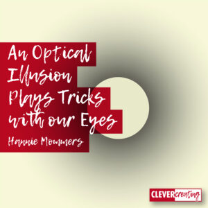
An Optical Illusion Plays Tricks with our Eyes

An Optical Illusion Plays Tricks with our Eyes

In 32 tips to get ideas to spend your free time is a pencil drawing of a shape, giving the optical illusion that the inner circle is much whiter than the surrounding white outside the circle.

A former colleague even made an airbrush in which the inside of such a form was darker than the environment, and still, it seemed lighter.

So I wanted to examine that. How much black can I add until the inner shape seems darker than the outer space?

Read more