Review: SolidWP – The Best WordPress Security Plugin in my Opinion

Review: SolidWP - The Best WordPress Security Plugin in my Opinion

Whenever I get the dreaded message that someone’s site is hacked, I thank my security plugin. 🙂 Most hosts take care of security as well of course, but in the end, it’s our own responsibility to make sure their efforts have effect.

The number of WordPress plugins I use is not big, although I don’t meet the recommended maximum of 5. Most of these plugins are free versions, but the one I am paying for – and with love – is SolidWP (formerly iThemes).

Read more

Is Tailwind Good or Bad at Scheduling Posts on Social Media Quickly?

Is Tailwind Good or Bad at Scheduling Posts on Social Media Quickly?

Whatever hobby or business we have, it is great to share our passion with the world, isn’t it? We can do this on a website or blog, and/or by using social media.

Posting to all the different available social media can be a very time-consuming activity. To make our lives easier in that regard, we can choose from different programs and platforms, like Tailwind, Hootsuite, Pallyy, and many more.

Is Tailwind good or bad to use for that task? After a year of working with it, it’s time for me to evaluate what the pros and cons are. 

Read more

What is Canva Used for and 5 More Important Questions

What is Canva Used for and 5 More Important Questions

Once your website makes enough money, assuming that’s your goal, you can outsource everything. But until then, you can use programs like Canva. Which leaves the question: What is Canva used for?

Having a website of your own means that you will use images. Not everybody wants to use images in their articles, but I can assure you it’s better to include them as most of us are visually oriented.

By adding images you have more impact on your visitors. Our brain processes 9 times more visual than textual information. Moreover, the brain takes up visually displayed information 60.000 times faster than textual.

Read more

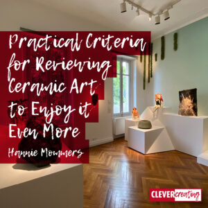
5 Practical Criteria for Reviewing Ceramic Art to Enjoy it Even More

5 Practical Criteria for Reviewing Ceramic Art to Enjoy it Even More

This summer I was able to rethink my criteria for reviewing ceramic art when Tom and I visited Villa Datris in France. 

A themed exhibition is organized in this villa every year. To my great luck, the theme this year (2022) was ceramics. The ceramic art was grouped over 4 floors and there was also a lot of ceramic work to be seen in the garden.

Thanks to founder Danièle Kapel-Marcovici’s love for art and her altruism, the villa and its exhibition is free to enter from May to October each year. It’s a marvellous initiative and was an unexpected discovery for us.

Read more

Review of 365 Days of Facebook Success: How to Build your Presence?

Review of 365 Days of Facebook Success: How to Build your Presence?

As a creative person, you want your work to stand out, right? So whether you feel like it or not, there’s no question that you should be doing marketing.

In this review of 365 Days of Facebook Success, I’ll tell you about my achievements with the program.

In my starting days as a graphic designer and artist, I always hated the idea of putting myself out there. Advertising was like a swearword and promoting myself in any way felt wrong.

Read more

Why is Choosing the Right Font Important to be Competitive?

Why is Choosing the Right Font Important to be Competitive?

Fonts have a look that tells something about the character of the person or company that chose them. For me, that has always been the main reason for the letter choices I made for a client. What should their appearance be?

But fonts have more aspects that influence that choice. It is important to know them in order to choose the right font.

While beautiful or ugly is one of those arguments, it is the least important of all. So, why is choosing the right font important?

Read more

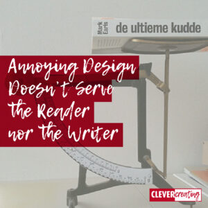
Annoying Design Doesn’t Serve the Reader nor the Writer

Annoying Design Doesn't Serve the Reader nor the Writer

I’m reading a book with a really annoying design! The content isn’t bothering me; I can’t judge that yet, because I’m not beyond page 25 at the moment.

No, I find “De ultieme kudde“, which is a Dutch translation of the book “Herd” an annoying book because of the cover with a rear flap folded too tight, leaving part of the interior open and exposed.

This looks like the nowadays visible underpants of the youth because of their sagging jeans. (Ah, and this book is right about phenomenons like sagging pants!).

Read more